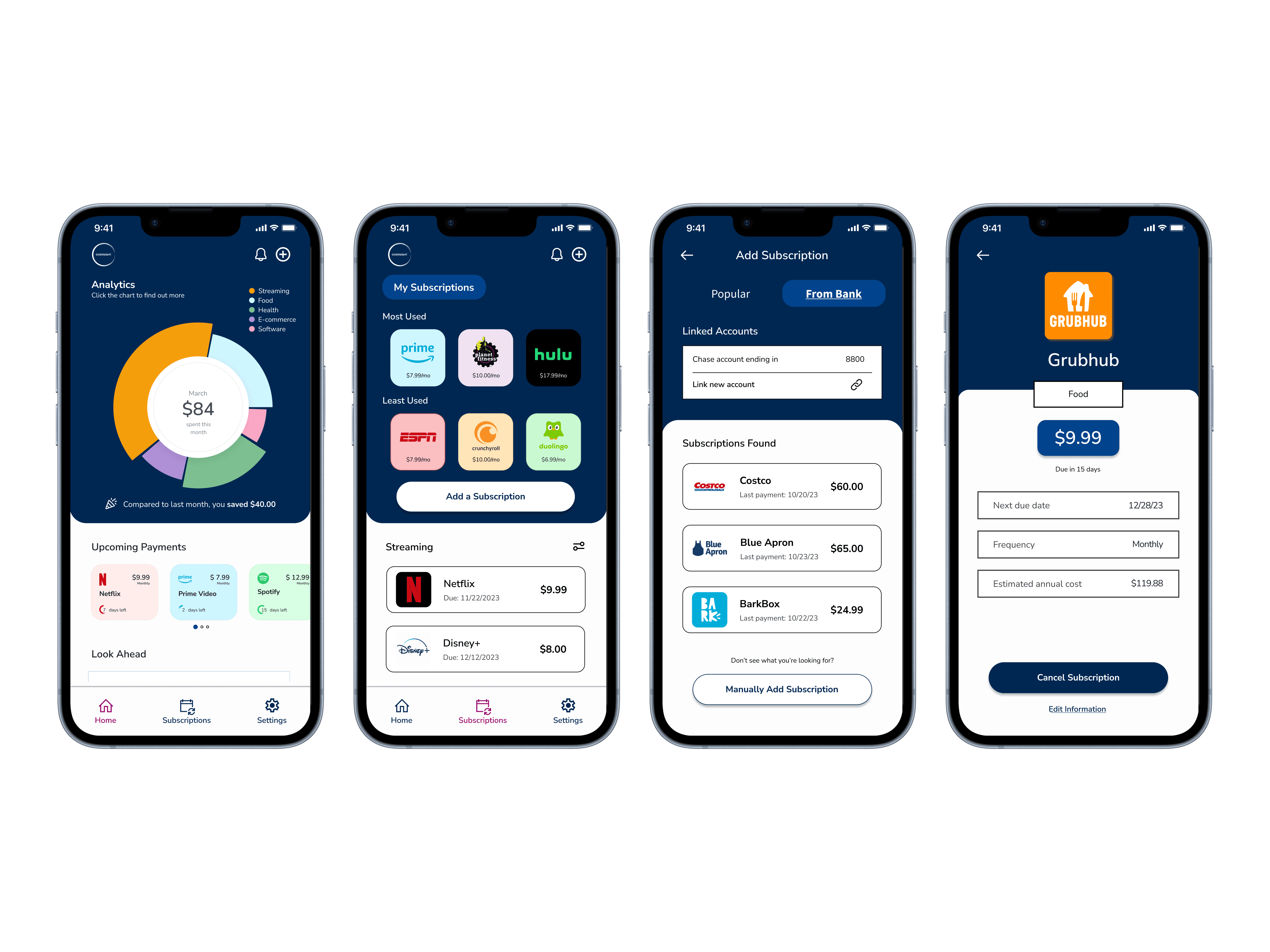
Oversight
Oversight

Streamlining subscription management to elevate financial control

Streamlining subscription management to elevate financial control

Project Overview

Project Overview

Project Overview

Problem

Problem

Consumers are overwhelmed with the multitude of subscriptions they have. Every month, a chunk of their money leaves their wallets and at times, this is attributed to subscriptions they no longer need.

Users are having a difficult time managing all of their subscriptions. 

Solution

Solution

  • Provide users with the freedom and control to cancel and add new subscription services


  • Increase financial awareness of spending patterns and usage to aid users in making an informed decision when managing subscriptions

Role

Role

UXUI Designer

Date

Date

October - November 2023

Google Ventures Design Sprint
(5 days)

Tools

Tools

Discover

Discover

Secondary Research

Secondary Research

Ideally, conducting user interviews would provide valuable first-hand insights from users directly, however, due to the time constraints of this project, opting for secondary research would be the next best thing


Secondary research focused on the following questions:


  • What drives users to subscribe to a service or product? 


  • How often do users check up on their monthly subscriptions?


  • Why do users keep subscriptions they no longer need? 

Findings

Findings

1.

1.

1.

Users enjoy simple, hassle-free ways to cancel a subscription service. 

Users enjoy simple, hassle-free ways to cancel a subscription service. 

2.

2.

2.

Overspending occurs due to forgetfulness and lack of organization

Overspending occurs due to forgetfulness and lack of organization

3.

3.

3.

Users are often not aware when their free-trials end

Users are often not aware when their free-trials end

—————————————————————————————————————

————————————————————————————————————————————————————

————————————————————————————————————————————————————————————————

—————————————

——————————————————————————

Design

Design

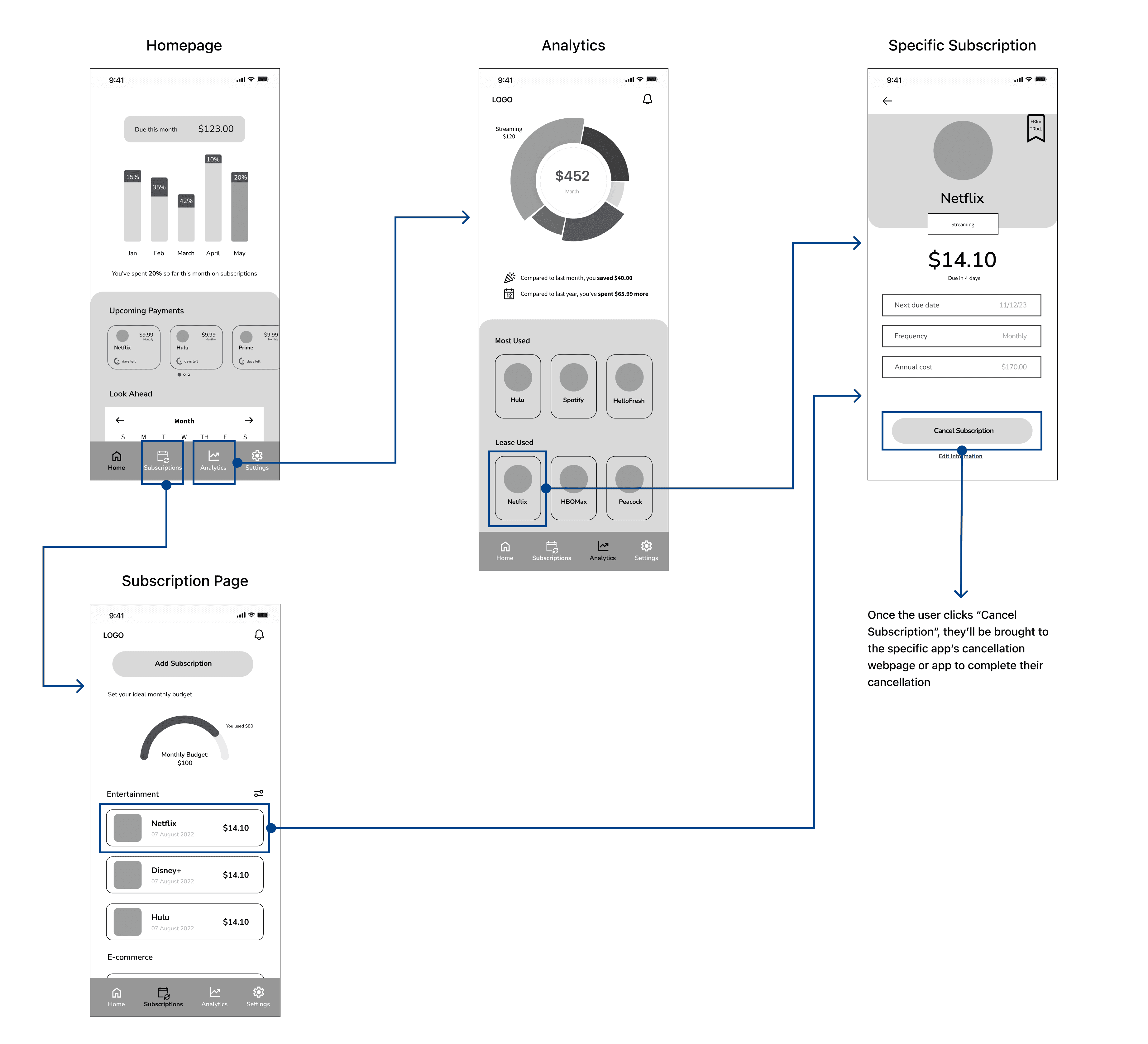
Wireflows

Wireflows

Key Painpoints

Key Painpoints

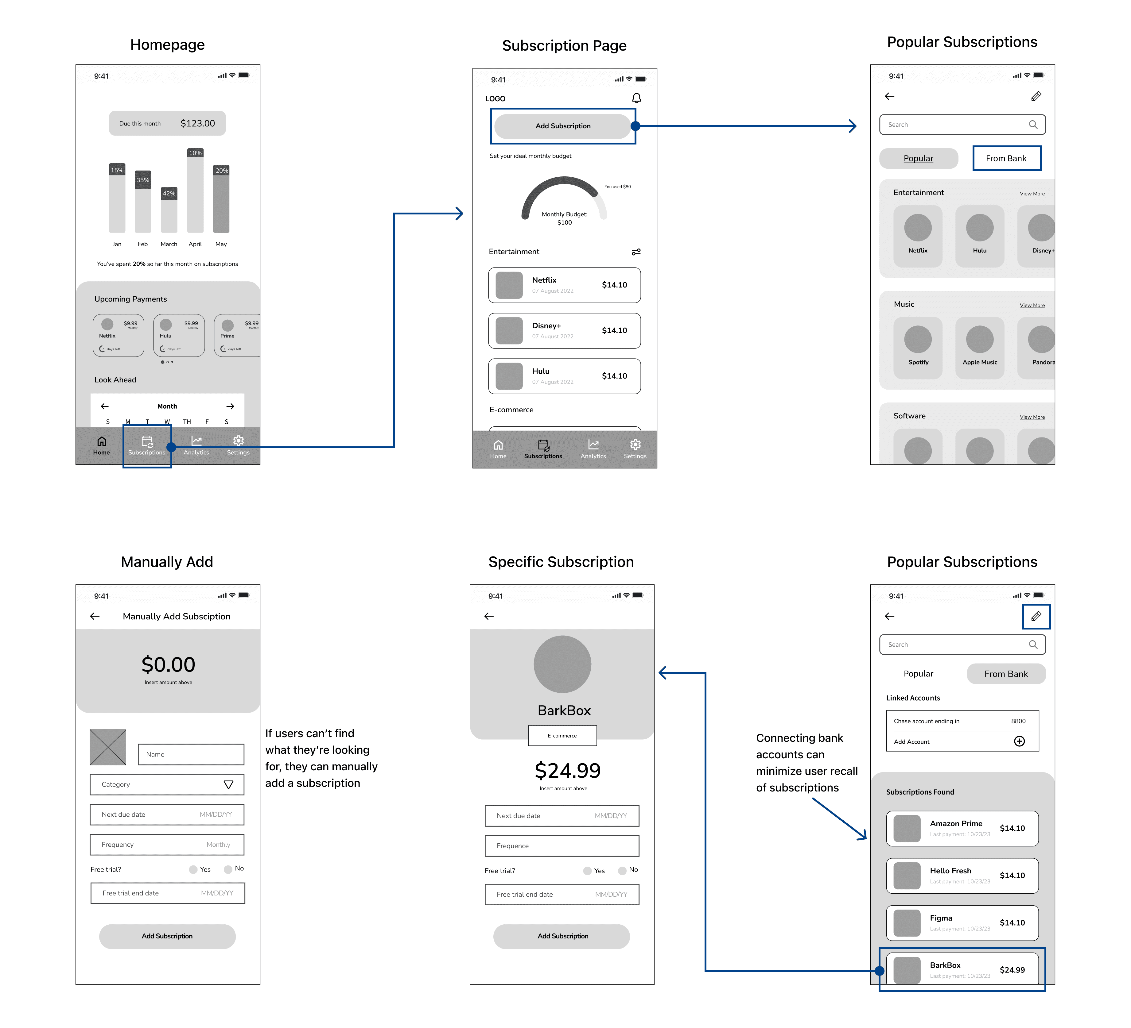
  • Users are not aware of all the subscriptions they have


  • It's too much work to cancel a subscription

Solution Ideation

Solution Ideation

  • Connect with their bank account, minimizing user recall of subscription services


  • Users should be able to easily cancel a subscription

  • Connect with their bank account, minimizing user recall of subscription services


  • Users should be able to easily cancel a subscription

Adding a Subscription

Adding a Subscription

Removing a Subscription

Removing a Subscription

—————————————————————————————————————

————————————————————————————————————————————————————

————————————————————————————————————————————————————————————————

—————————————

——————————————————————————

Ideation

Ideation

Question


What features can be implemented to enhance user awareness and improve organization?
Question


How can subscription information be made more digestible for users?

Design solutions


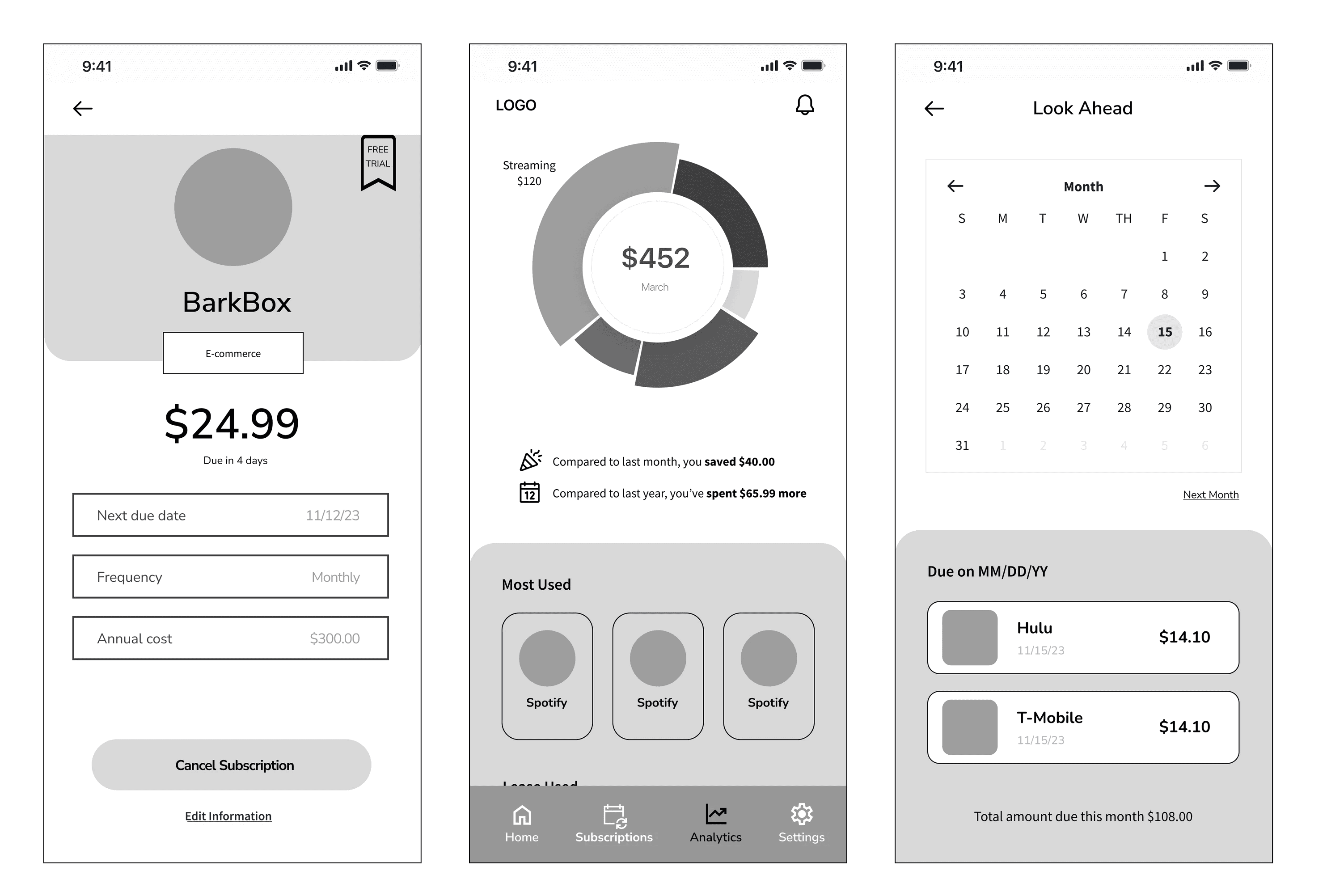
  • Upcoming payments to help remind users about their subscriptions 


  • Budgeting goals for financial motivation


  • Ability to log free-trial periods to set reminders 

Design solutions


  • Upcoming payments to help remind users about their subscriptions 


  • Budgeting goals for financial motivation


  • Log free-trial periods to set reminders 

Design solutions


  • Upcoming payments to help remind users about their subscriptions 


  • Budgeting goals for financial motivation


  • Ability to log free-trial periods to set reminders 

Design solutions


  • Categorize the subscriptions for scannability and reduce cognitive load


  • Use of infographics and icons/logos to aid in memory retention and reduce clutter 

Design solutions


  • Categorize the subscriptions for scannability and reduce cognitive load


  • Use of infographics and icons/logos to aid in memory retention and reduce clutter 

Design solutions


  • Categorize the subscriptions for scannability and reduce cognitive load


  • Use of infographics and icons/logos to aid in memory retention and reduce clutter 

Ideation Question


How can subscription information be made more digestible for users?

—————————————————————————————————————

————————————————————————————————————————————————————

————————————————————————————————————————————————————————————————

—————————————

——————————————————————————

Validate: Round I

Validate: Round I

Guerilla Testing

Guerilla Testing

Findings & Redesign

Findings & Redesign

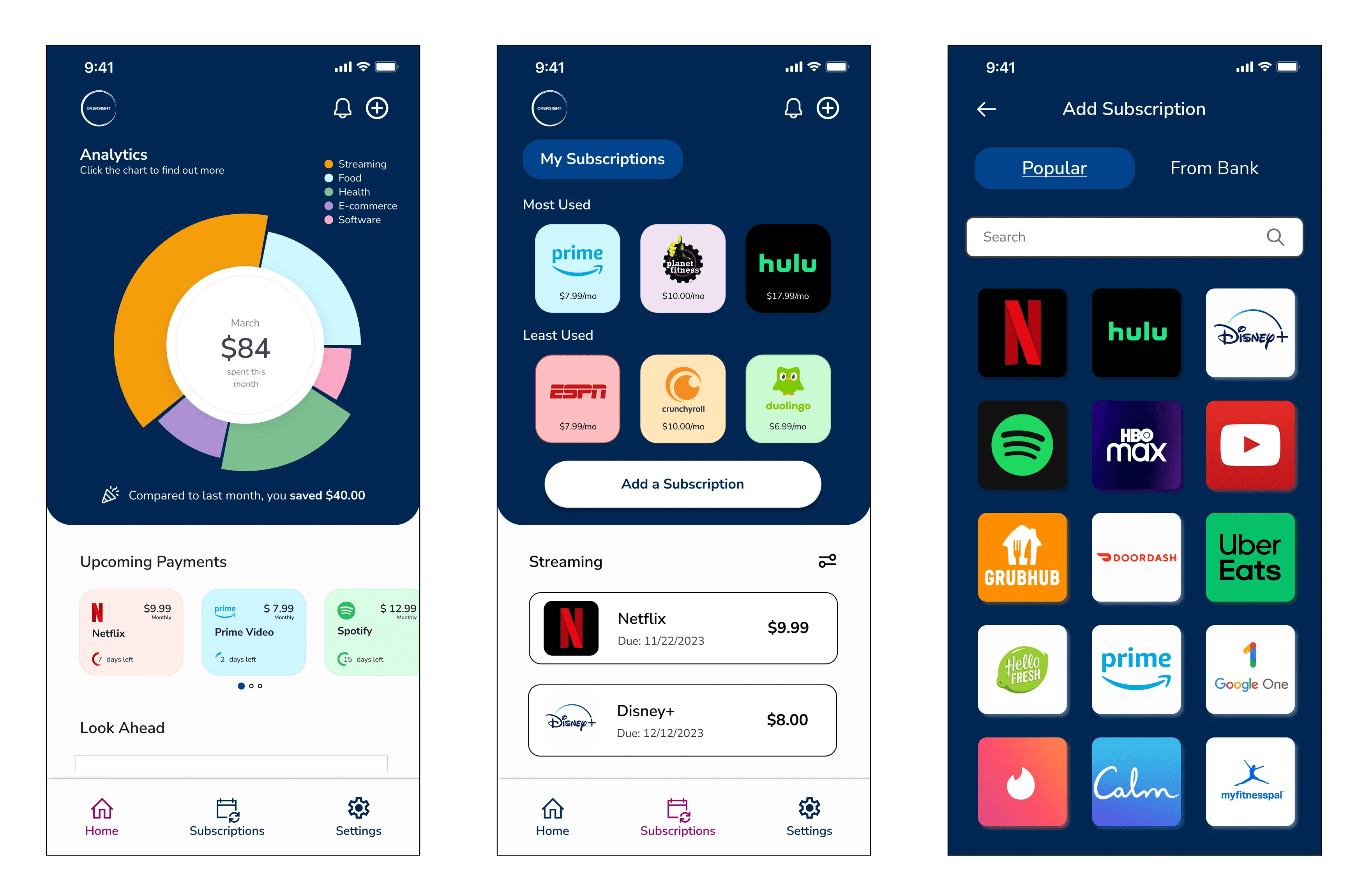
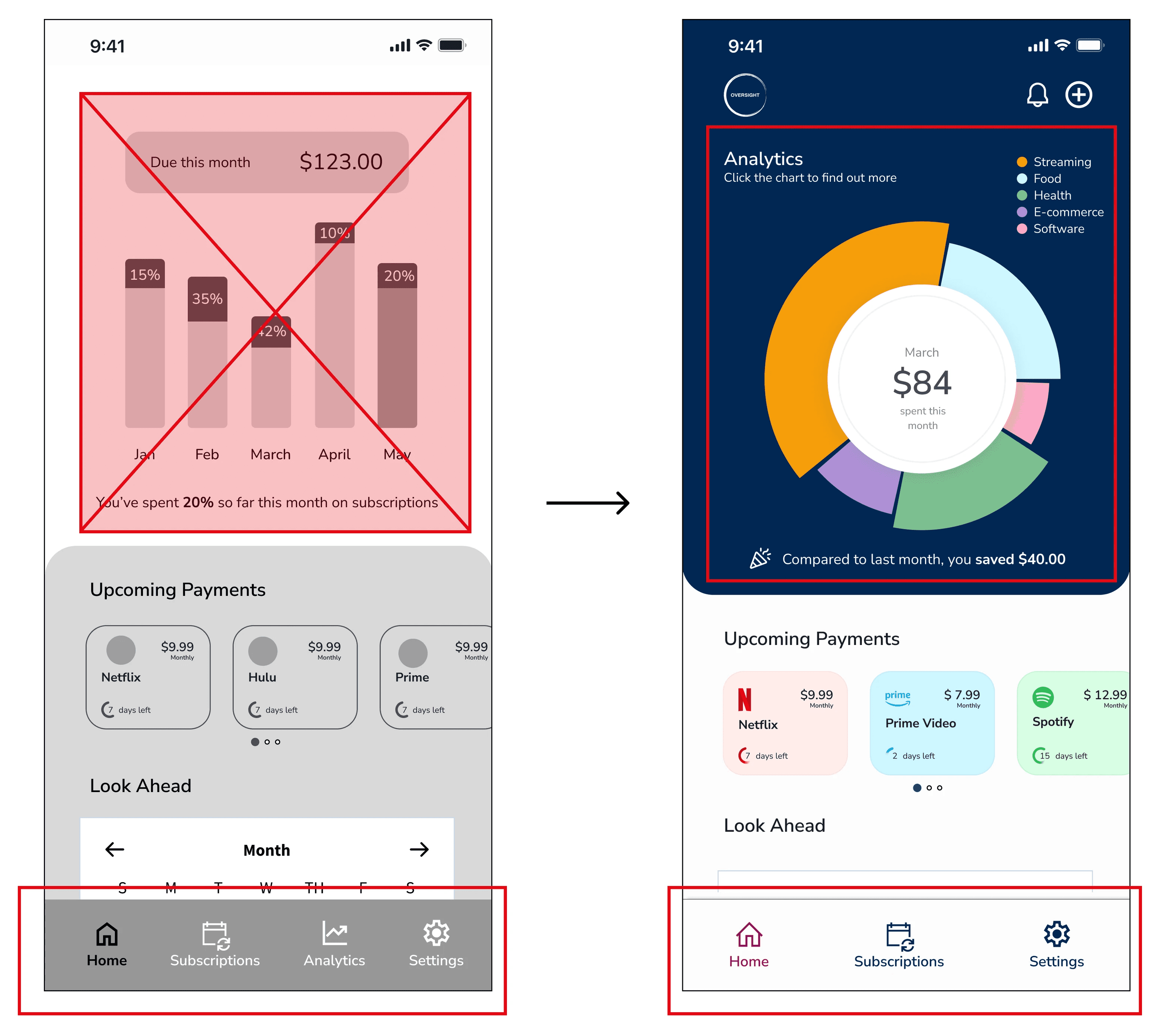
After considering the findings from the Guerilla testing, I iterated on the low-fidelity screens and incorporated the style guide to create a high-fidelity prototype.

After considering the findings from the Guerilla testing, I iterated on the low-fidelity screens and incorporated the style guide to create a high-fidelity prototype.

Findings:


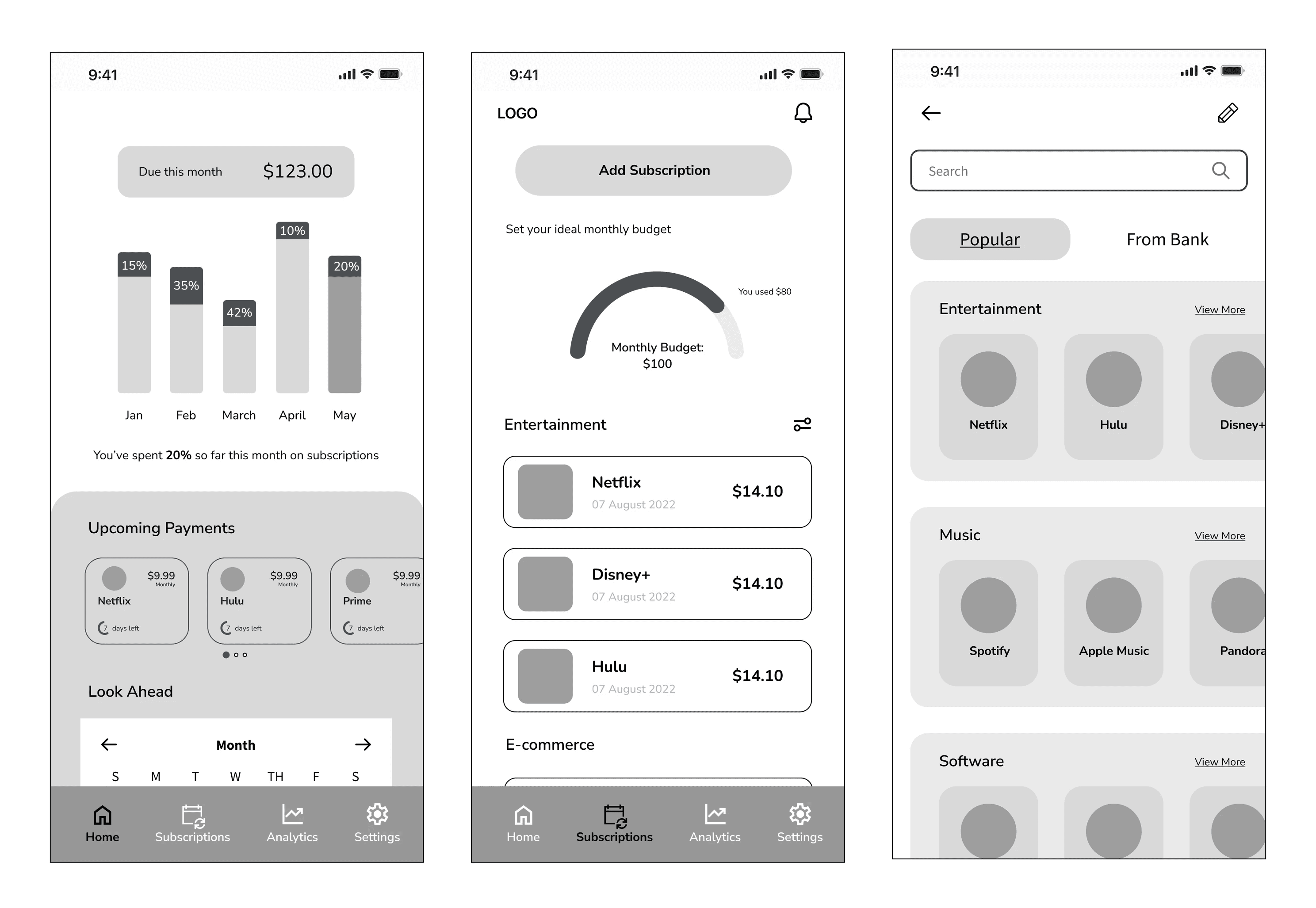
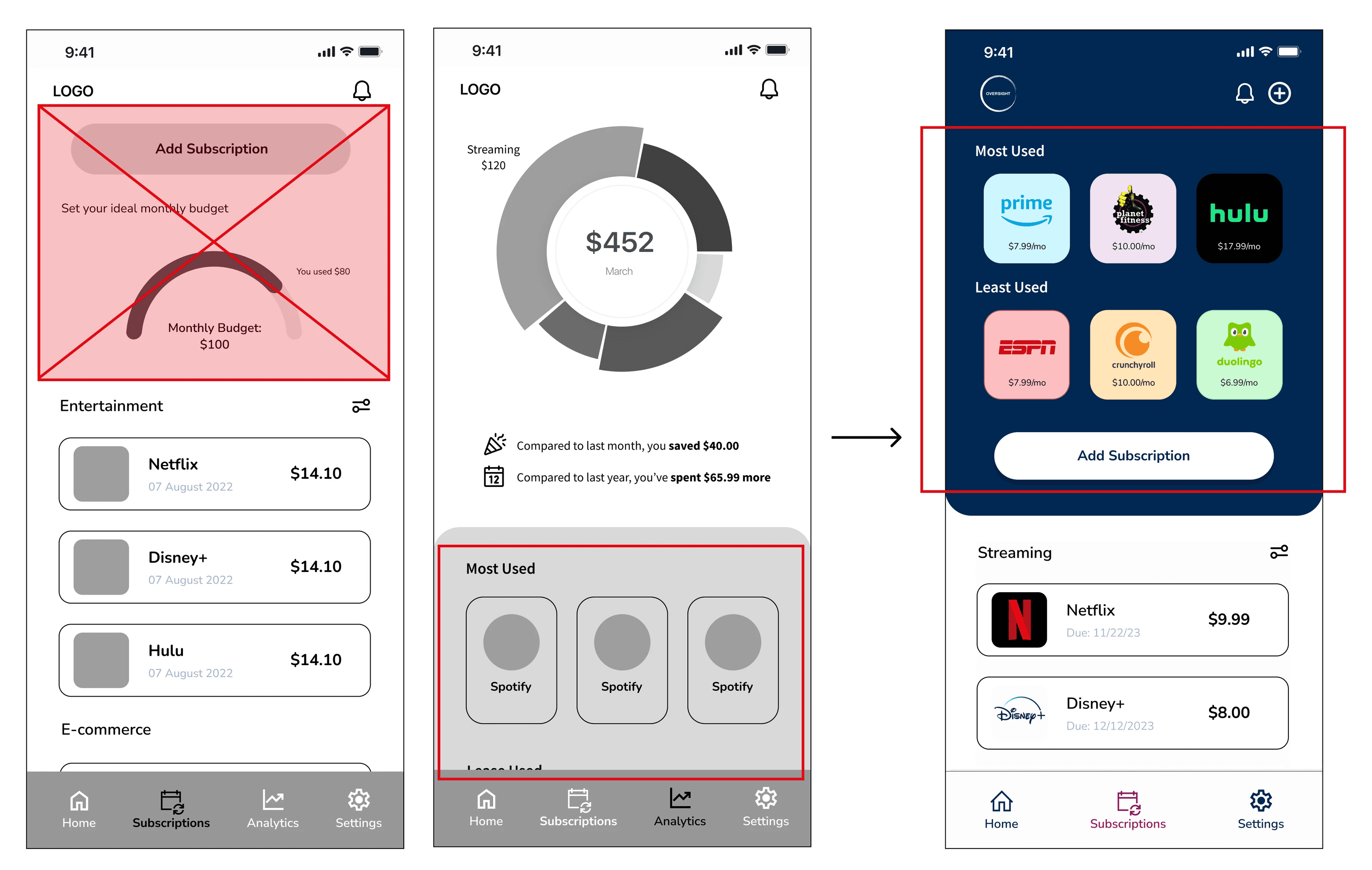
  • Users found the graph on the homescreen confusing, leading to uncertainity about whether the app was designed for subscription or financial management.


  • Users' preference for clicking on the 'Subscription' tab before 'Analytics' when seeking information about subscription usage/data suggests that the analytics page may not be essential.


Solutions:


  • Removing the homescreen graph and replacing it with a pie chart to summarize users' main subscription categories.


  • Incorporate 'Most Used' and 'Least Used' data directly onto the Subscription screen, subsequently eliminating the Analytics section.

Solutions:


  • Removing the homescreen graph and replacing it with a pie chart to summarize users' main subscription categories.


  • Incorporate 'Most Used' and 'Least Used' data directly onto the Subscription screen, subsequently eliminating the Analytics section.

Findings:


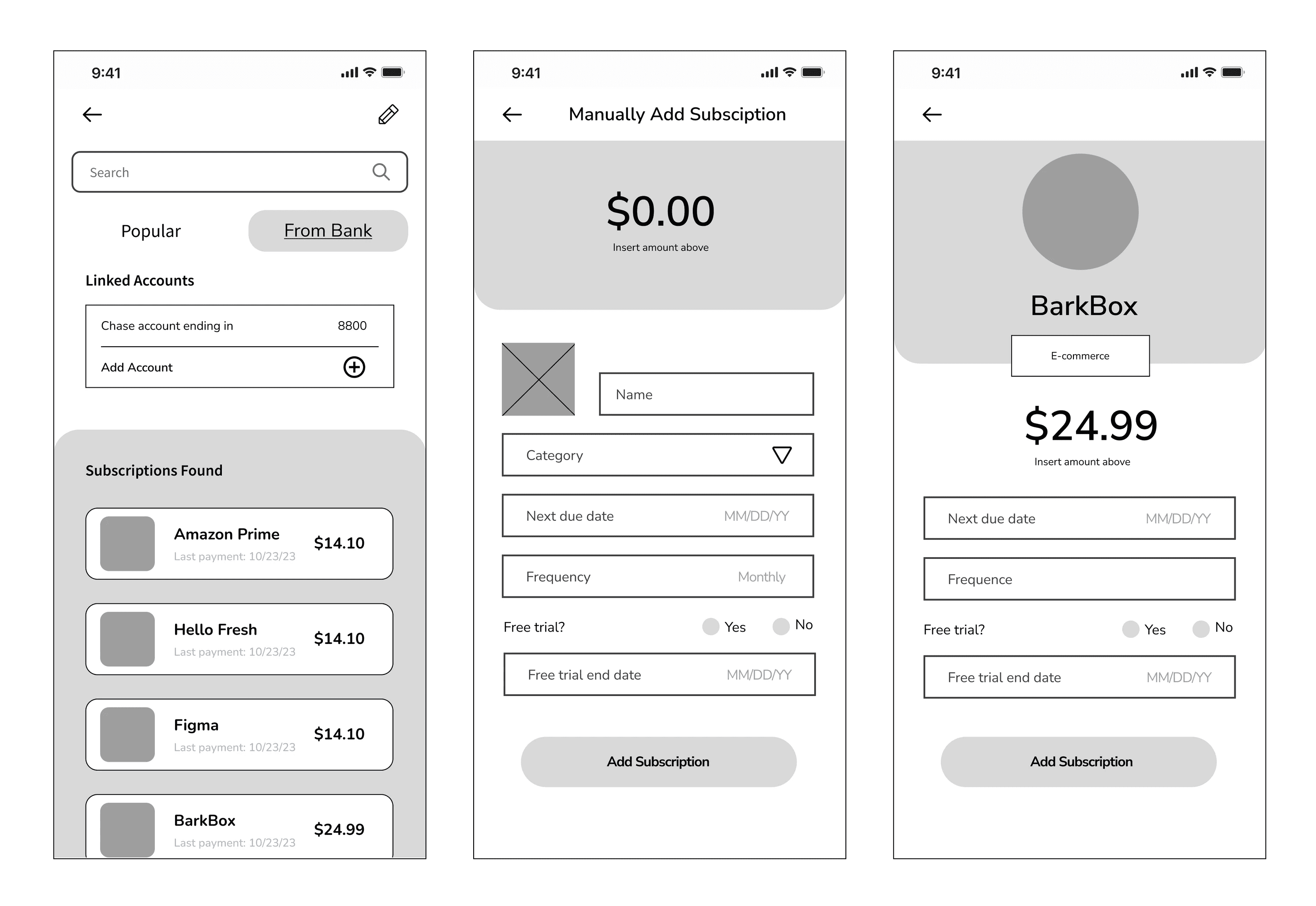
  • Users were uncertain about what the pencil icon meant


  • Users frequently opted to 'search' for a subscription instead of clicking 'view more' on the page.

Findings:


  • Users were uncertain about what the pencil icon meant


  • Users frequently opted to 'search' for a subscription instead of clicking 'view more' on the page.


Solutions:


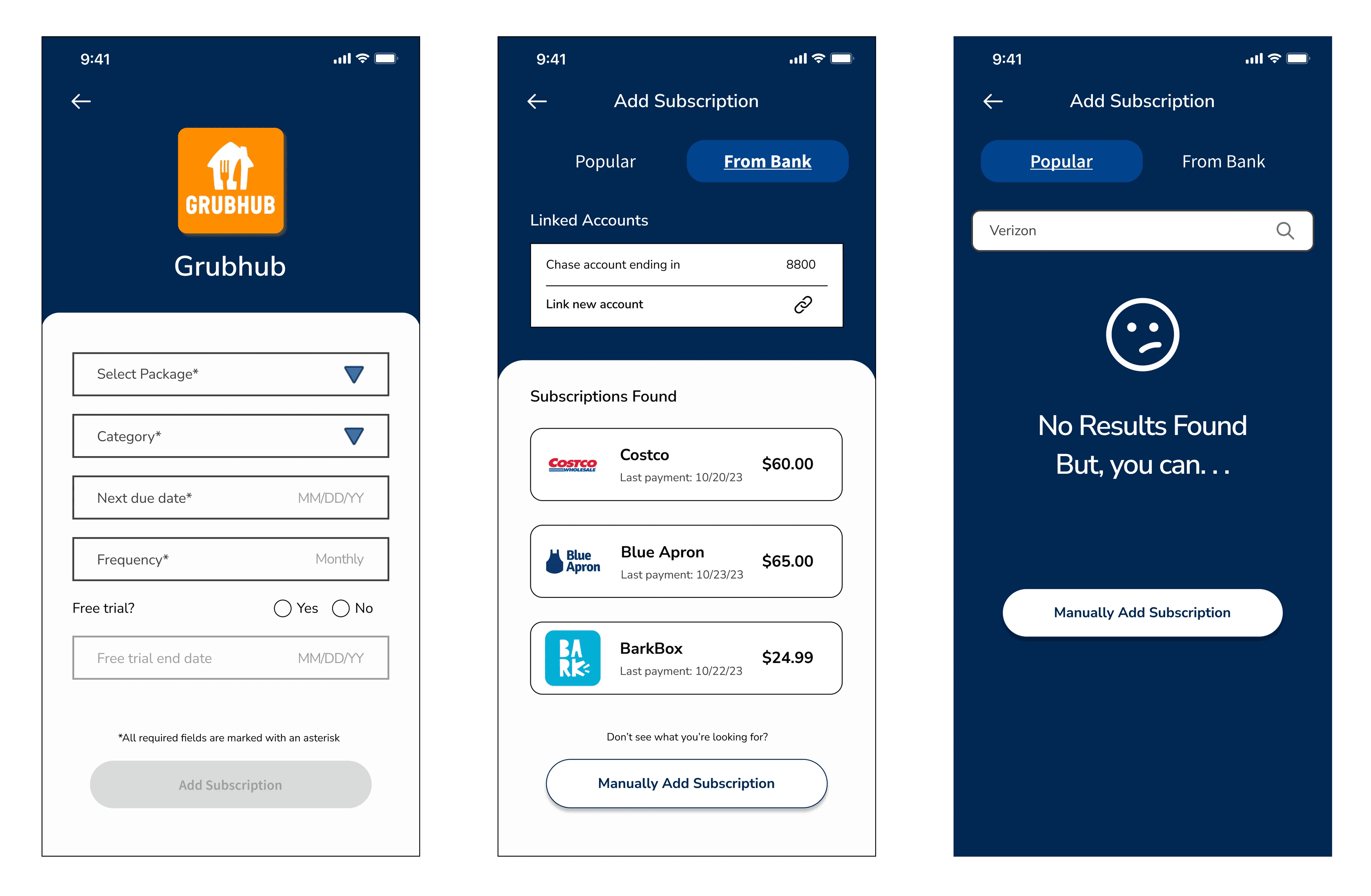
  • Replace the pencil icon with a '+' icon.

    • Given the presence of the '+' icon in the banking section, update 'Add account' to 'Link account' and replace the icon with a 'Link' icon to reduce user errors and confusion.


  • Create a screen to inform users they can manually add a subscription if they can’t find what they’re looking for 


  • Remove ‘view more’ and categories for the Popular tab since many people did not utilize the information

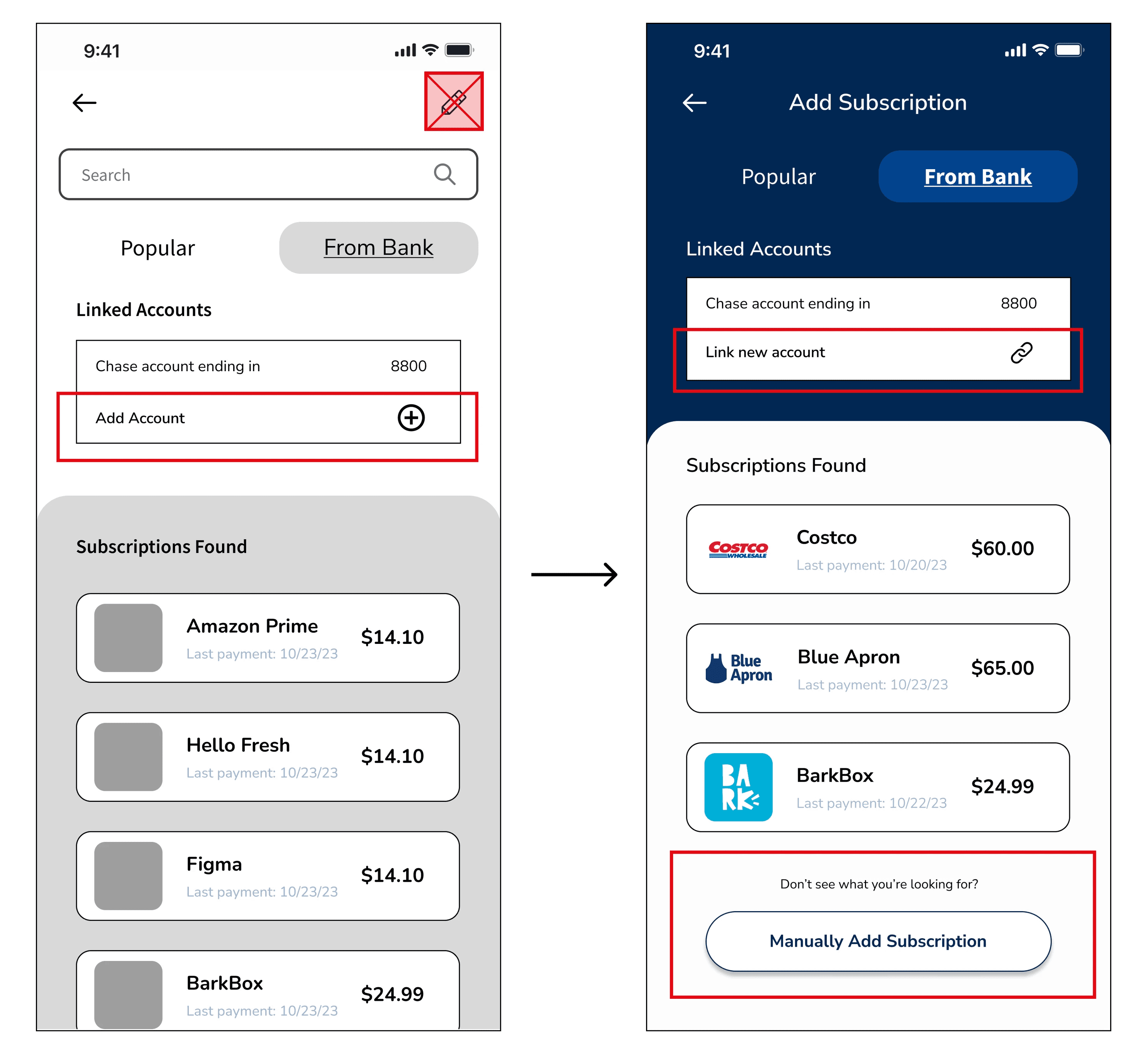
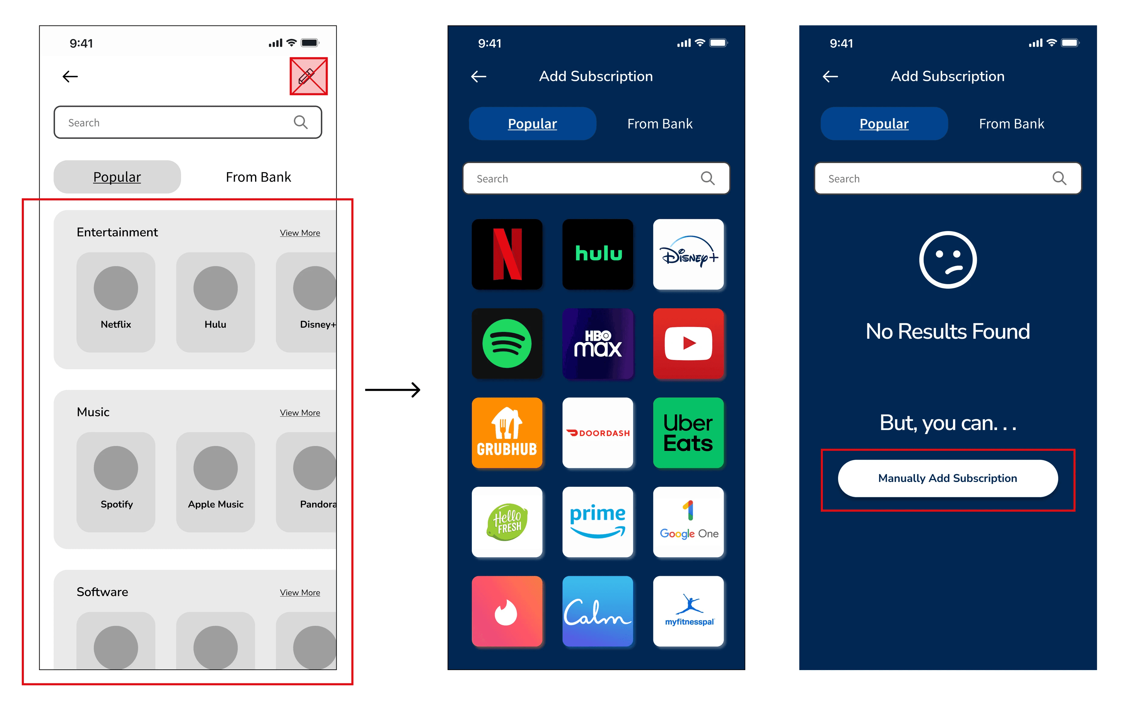
Findings:


  • Users were uncertain about what the pencil icon meant


  • Users frequently opted to 'search' for a subscription instead of clicking 'view more' on the page.

Solutions:


  • Replace the pencil icon with a '+' icon.

    • Given the presence of the '+' icon in the banking section, update 'Add account' to 'Link account' and replace the icon with a 'Link' icon to reduce user errors and confusion.


  • Create a screen to inform users they can manually add a subscription if they can’t find what they’re looking for 


  • Remove ‘view more’ and categories for the Popular tab since many people did not utilize the information

—————————————————————————————————————

————————————————————————————————————————————————————

————————————————————————————————————————————————————————————————

—————————————

——————————————————————————

Validate: Round II

Validate: Round II

Usability Test

Usability Test

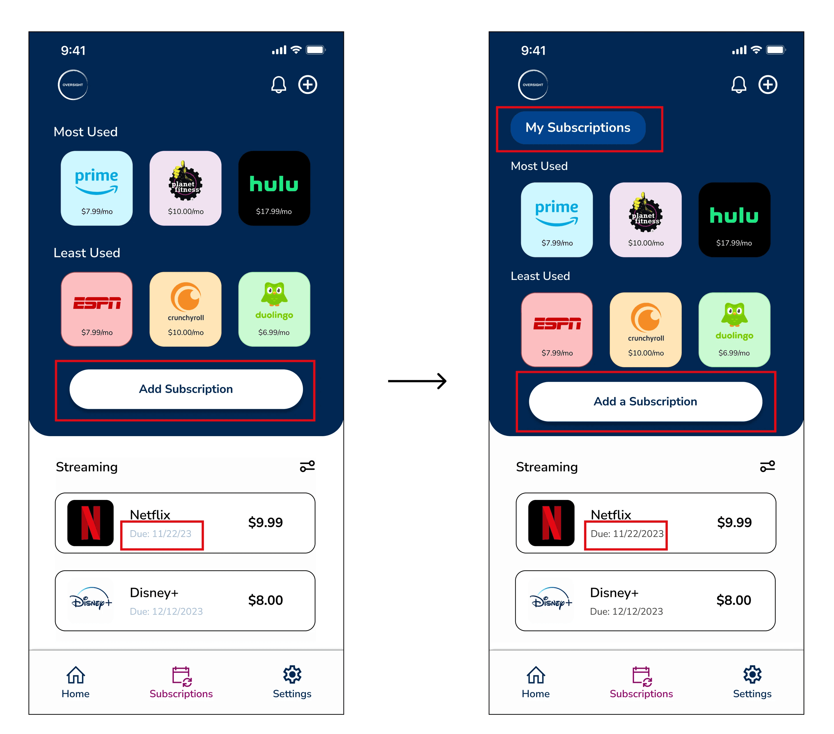
Finding:


  • Users didn’t understand they were viewing their subscription list from the ‘Subscription’ screen 


Solutions:


  • Included 'My Subscriptions' header to clarify that users are looking at their subscription list.


  • Changed ‘Add subscription’ to ‘Add a Subscription’ to clarify wording 


  • Changed the color of due dates for accessibility standards 
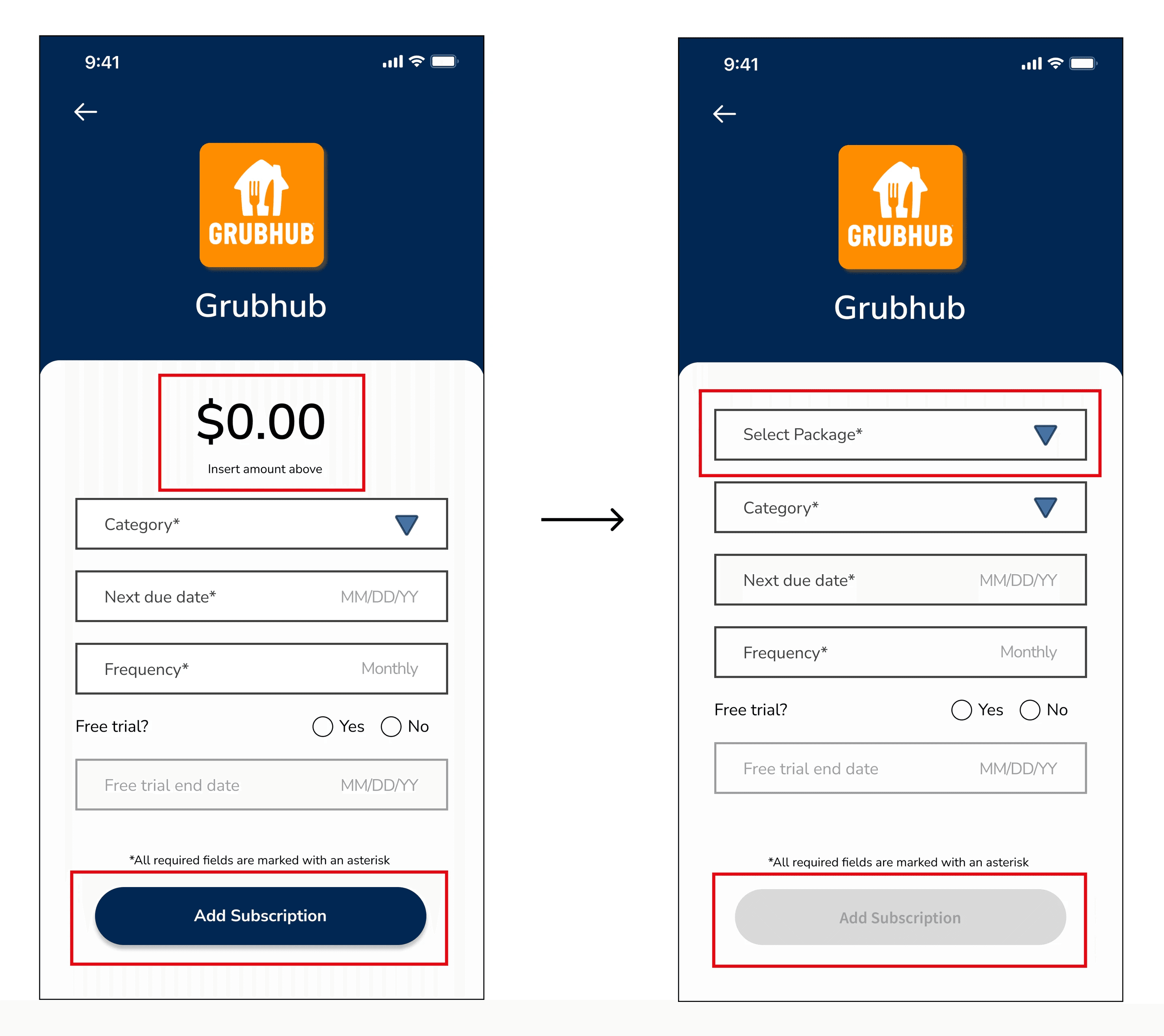
Finding:


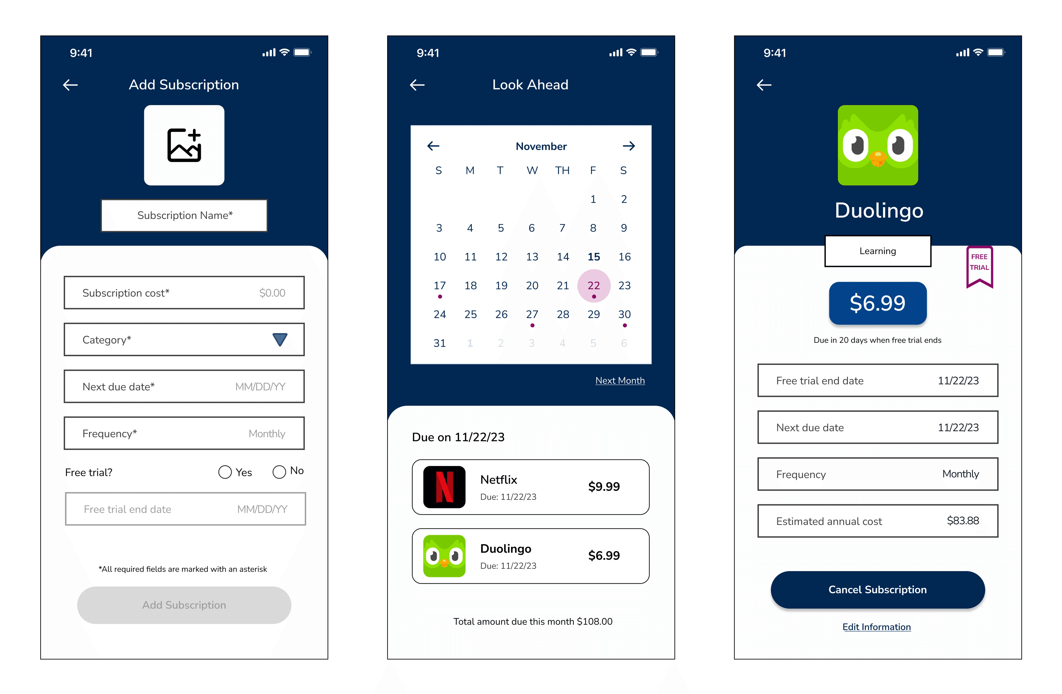
  • The process of entering costs for subscriptions lacked clarity, leading to users overlooking this step, or being unaware that they could input values into the designated field.


Solutions:


  • Incorporated a cost dropdown menu for popular subscriptions, reducing the need for users to recall the exact cost of their subscription.


  • Modified the button to remain disabled until all mandatory fields have been completed.
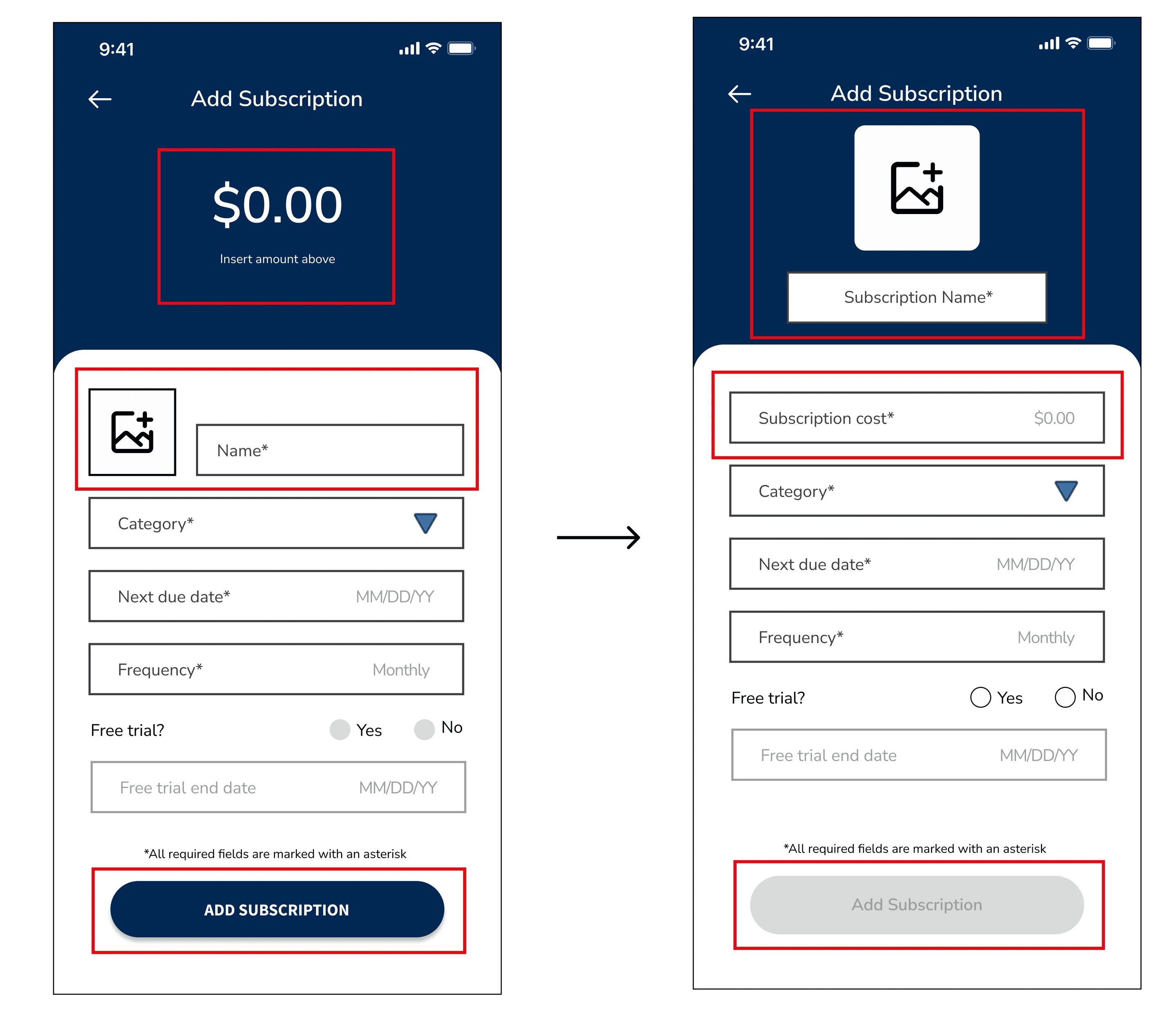
Finding:


  • Lack of consistency: users took longer to complete the task to manually add a subscription because they were familiar with seeing a specific layout


Solutions:


  • Created more consistency on the page by changing the placement of the cost input, photo, and name to match other screens


  • Utilized a disabled button until all required fields have been completed 
—————————————————————————————————————

————————————————————————————————————————————————————

————————————————————————————————————————————————————————————————

—————————————

——————————————————————————

Final Design

Final Design

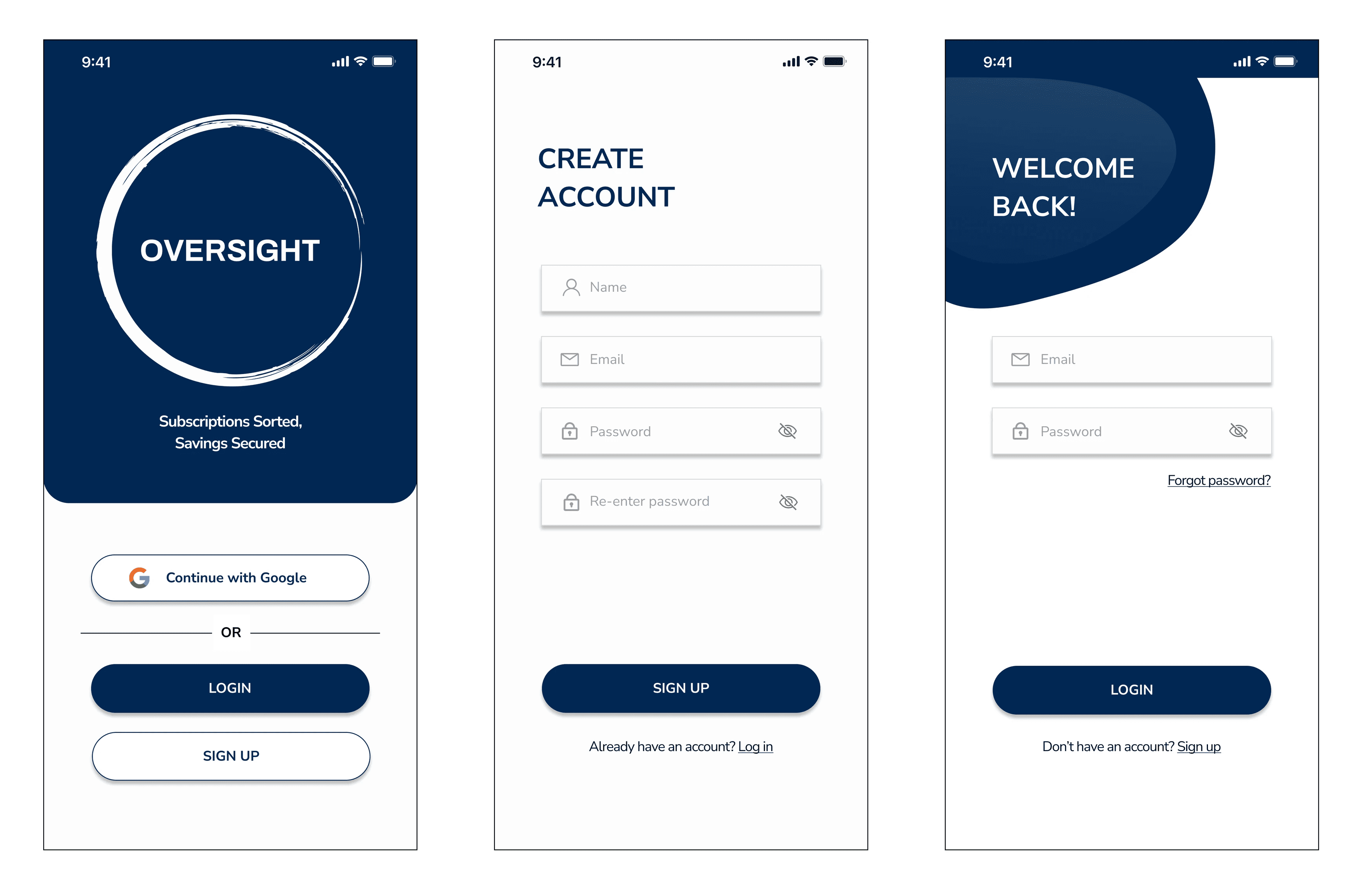
High-Fidelity Screens

High-Fidelity Screens

Prototype

Prototype

—————————————————————————————————————

————————————————————————————————————————————————————

————————————————————————————————————————————————————————————————

————————————

——————————————————————————

Reflection & Next Steps

Reflection & Next Steps

Reflection & Next Steps

Prepare for the unexpected

Prepare for the unexpected

Prepare for the unexpected

In the process of conducting usability tests, I realize the importance of allocating more time to address user misunderstandings and inquiries. There should always be an opportunity to invest in thinking about follow-up questions that could be posed to facilitate the testing session, without leading user responses.

Determine all metrics

Determine all metrics

Determine all metrics

While analyzing the data, I found it helpful to keep an organized log of all my notes. Looking ahead, I plan to incorporate the timing of user task completion and establish clear criteria to define what qualities as a successful task completion.


Next steps include:

1.

1.

1.

Integrate Accounts

Integrate Accounts

Integrate Accounts

Link subscription accounts on the platform, allowing users to directly log in to an account when they'd like to cancel a subscription, without the need to recall usernames and passwords

2.

2.

2.

Enhance engagement

Enhance engagement

Enhance engagement

Incorporate micro-interactions on the pie chart to enhance user engagement with the content.

Let's connect!

Let's connect!