teacher trove
teacher trove

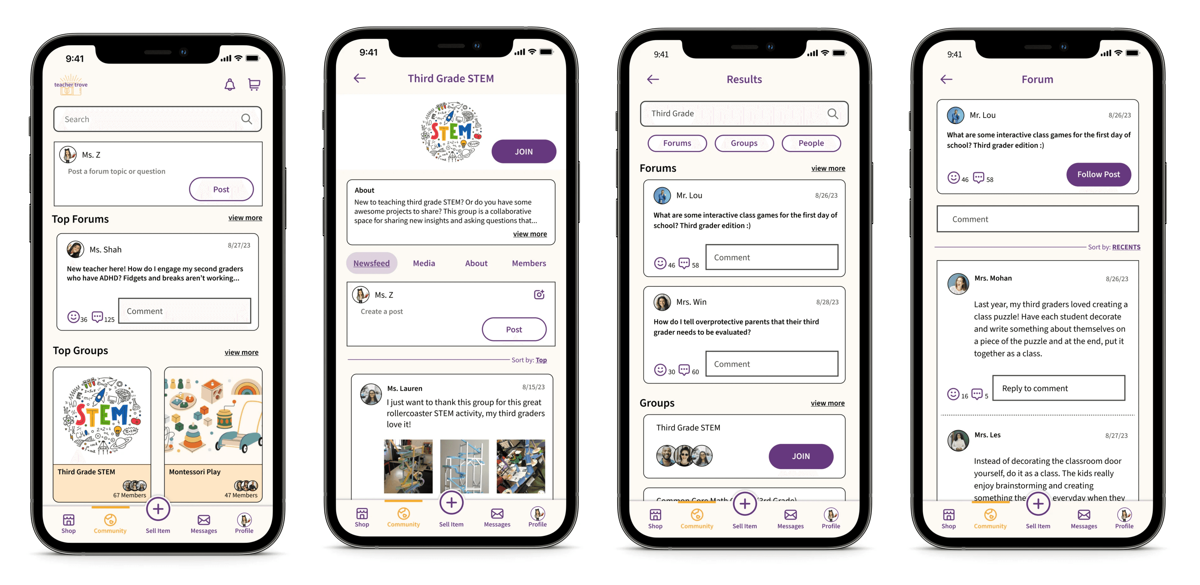
To minimize financial burden and foster a sense of community amongst educators

To minimize financial burden and foster a sense of community amongst educators

Project Overview

Project Overview

Project Overview

Problem

Problem

90% of teachers spend their own money each year to keep the classroom running.
The financial burden, coupled with a lack of support is causing emotional strain for educators trying to provide quality education, resulting in burnout and noticeable decline in job satisfaction

90% of teachers spend their own money each year to keep the classroom running.
The financial burden, coupled with a lack of support is causing emotional strain for educators trying to provide quality education, resulting in burnout and noticeable decline in job satisfaction

Solution

Solution

  • Reduce financial strain by creating a marketplace for educators to buy and sell classroom goods from one another


  • Establish a community platform where educators can collaborate and share insights

Role

Role

UXUI Designer

Date

Date

August - October 2023

Tools

Tools

Discover

Discover

Secondary Research

Secondary Research

Secondary research was conducted to better understand:


  • Does school funding affect the overall education experience of students?


  • How often/much do teachers in the US have to spend their own money for their classrooms? 

  • Why do teachers need to pay for classroom supplies?

Secondary research was conducted to better understand:


  • Does school funding affect the overall education experience of students?


  • How often/much do teachers in the US have to spend their own money for their classrooms? 

  • Why do teachers need to pay for classroom supplies?

Findings

Findings

1.

1.

1.

Not only is there a positive correlation between a well funded classroom and academic success, but also the future success of the students

2.

2.

2.

High turnover rates are a result of teachers feeling a lack of support in schools

3.

3.

3.

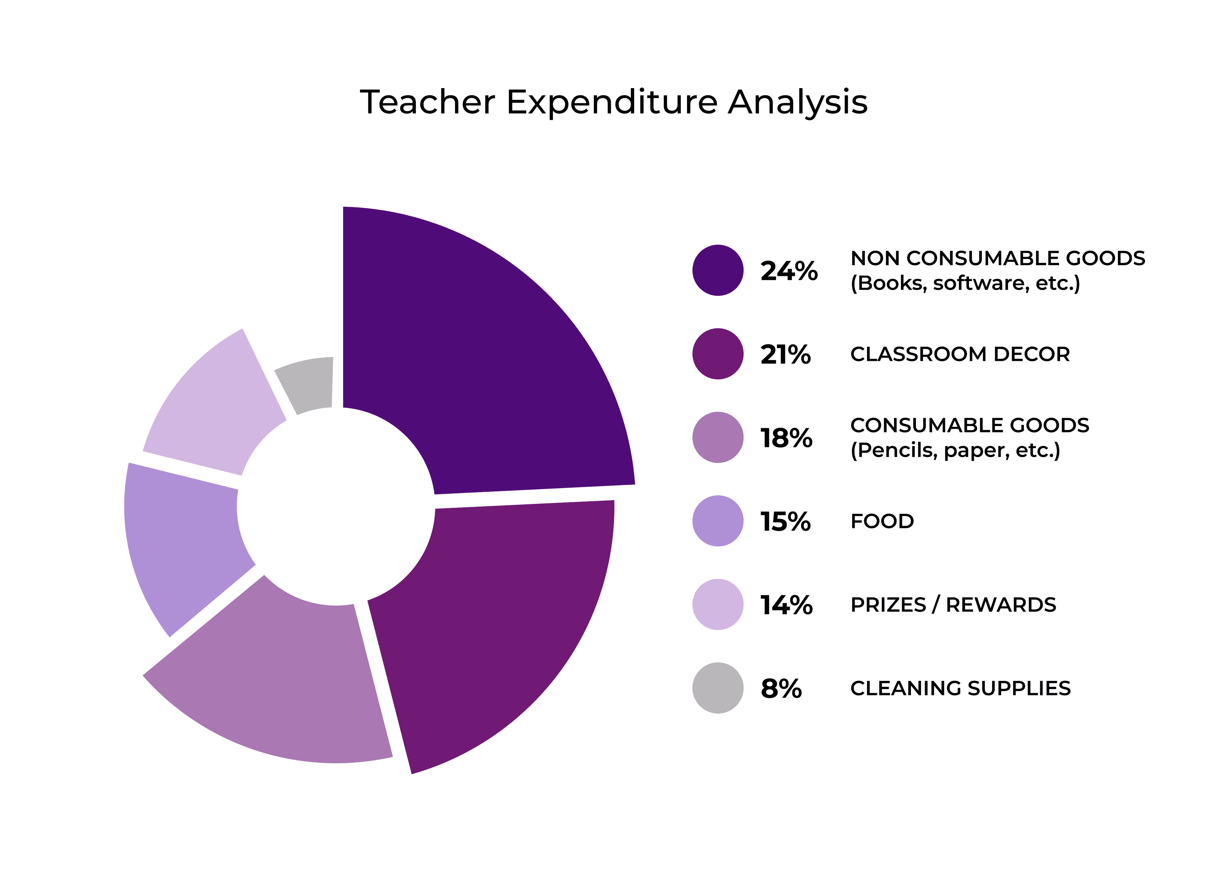
In 2023, teachers spent an average of $820 on their classrooms to: keep students motivated, have a comfortable environment to learn, and to manage behavior
—————————————————————————————————————

——————————————————————————

————————————————————————————————————————————————————————————————

————————————————————————————————————————————————————

Primary Research: Interviews

Primary Research: Interviews

To learn about personal experiences of teachers, user interviews were conducted to uncover answers to the following:


What do teachers do when they need a resource in the classroom?


What are the day-to-day stressors of the role of a teacher?


How often do teachers spend their own money in the classroom? Why do teachers spend their own money?
Affinity Map

Affinity Map

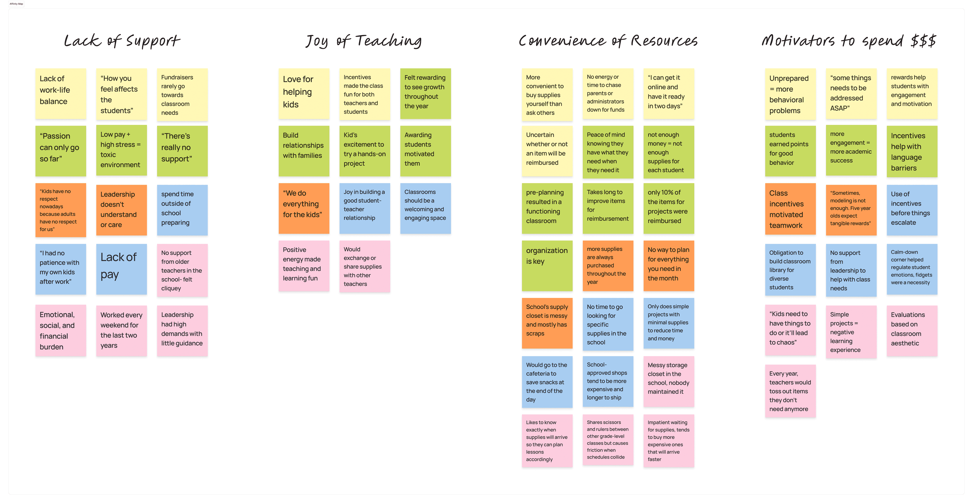
Each interview was color-coded and significant quotes, ideas, and topics were extracted to reveal common themes

Each interview was color-coded and significant quotes, ideas, and topics were extracted to reveal common themes

Interview findings

  • Low pay + lack of support + high expectations = toxic environment 

  • Convenience of resources: Due to scarcity of energy and time, educators can't afford to spend countless hours to find what they need at a cheaper cost 


  • Reasons for personal expenditure: Higher student engagement and motivation led to fewer behavioral problems 

Interview findings


  • Low pay + lack of support + high expectations = toxic environment 


  • Convenience of resources: Due to scarcity of energy and time, educators can't afford to spend countless hours to find what they need at a cheaper cost 


  • Reasons for personal expenditure: Higher student engagement and motivation led to fewer behavioral problems 

—————————————————————————————————————

————————————————————————

————————————————————————————————————————————————————————————————

————————————————————————————————————————————————————

Empathy Maps

Empathy Maps

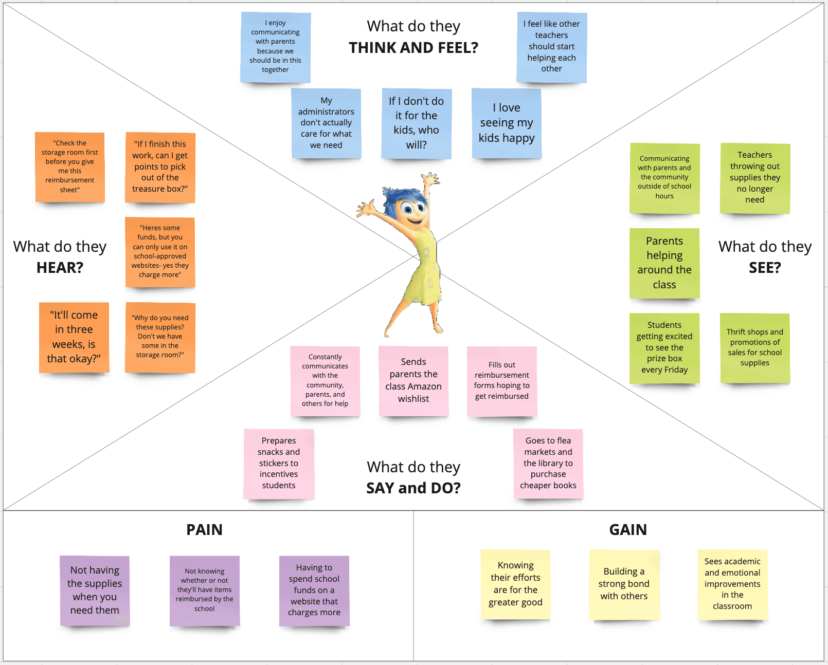
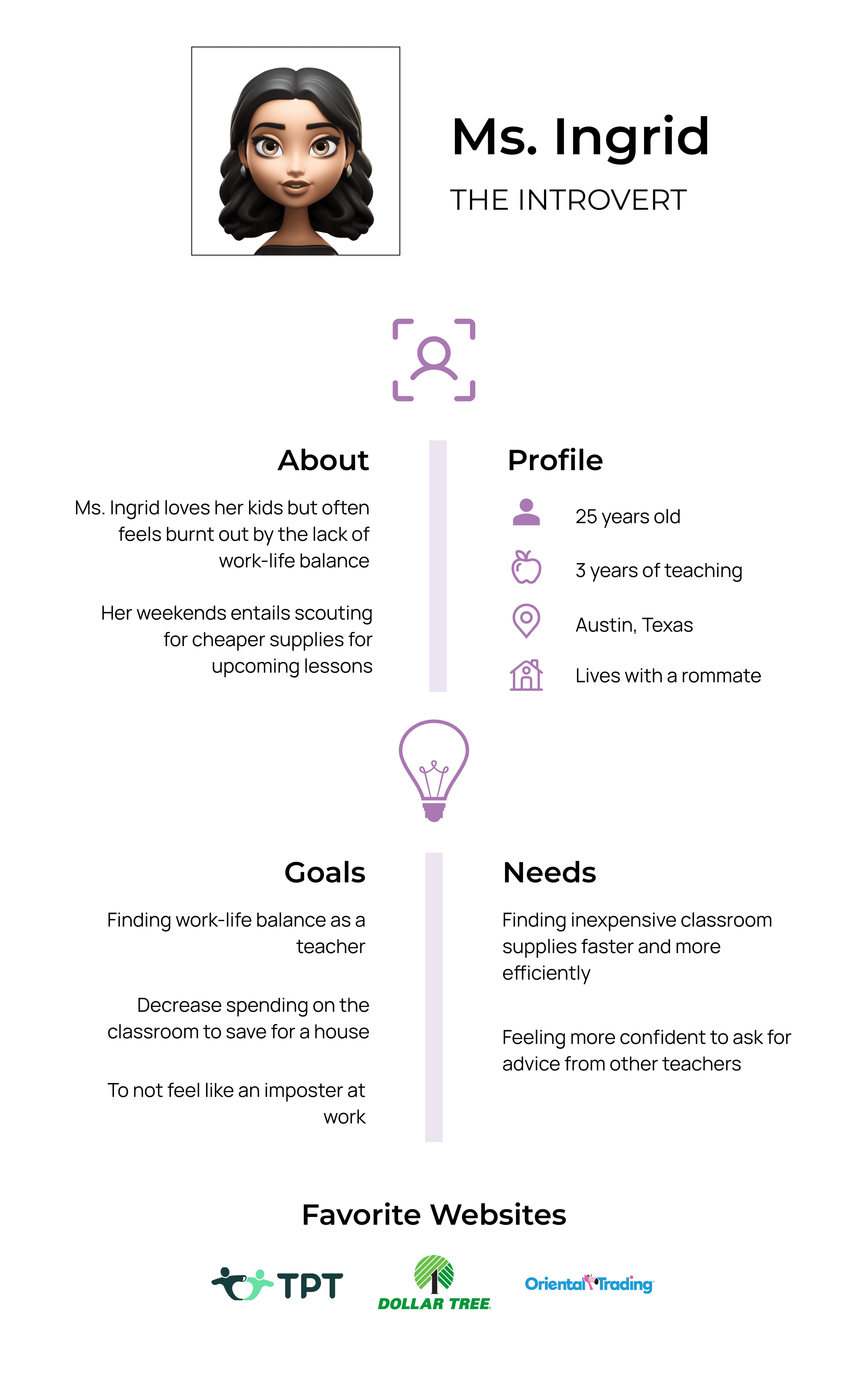
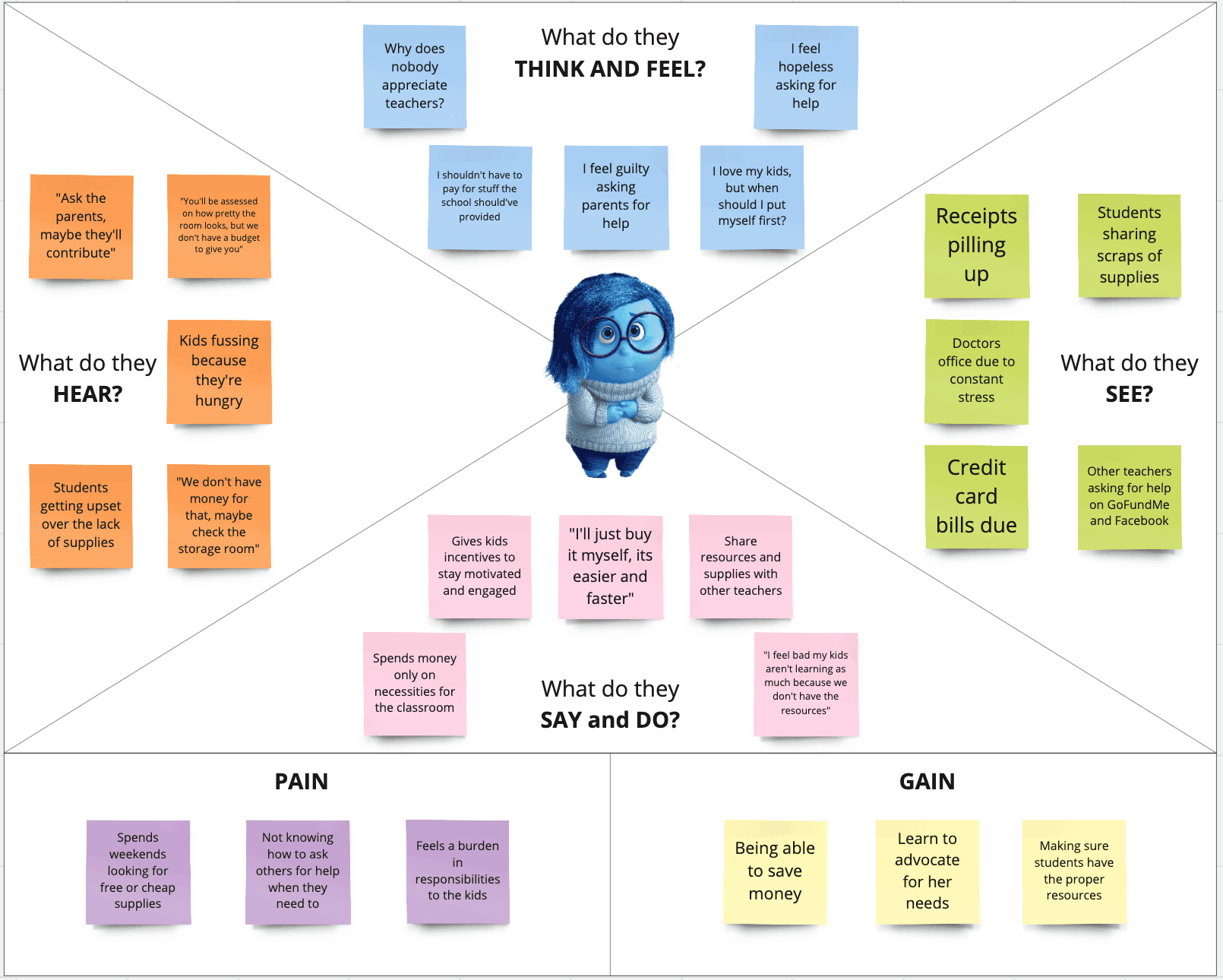
The first user is represented by Sadness from the movie Inside Out.


Similar to the character, the user is introverted and independent.


They’re trying to be more optimistic about working within the financial constraints of a school but they feel frustrated that it’s ultimately their responsibility to provide everything for the kids. 

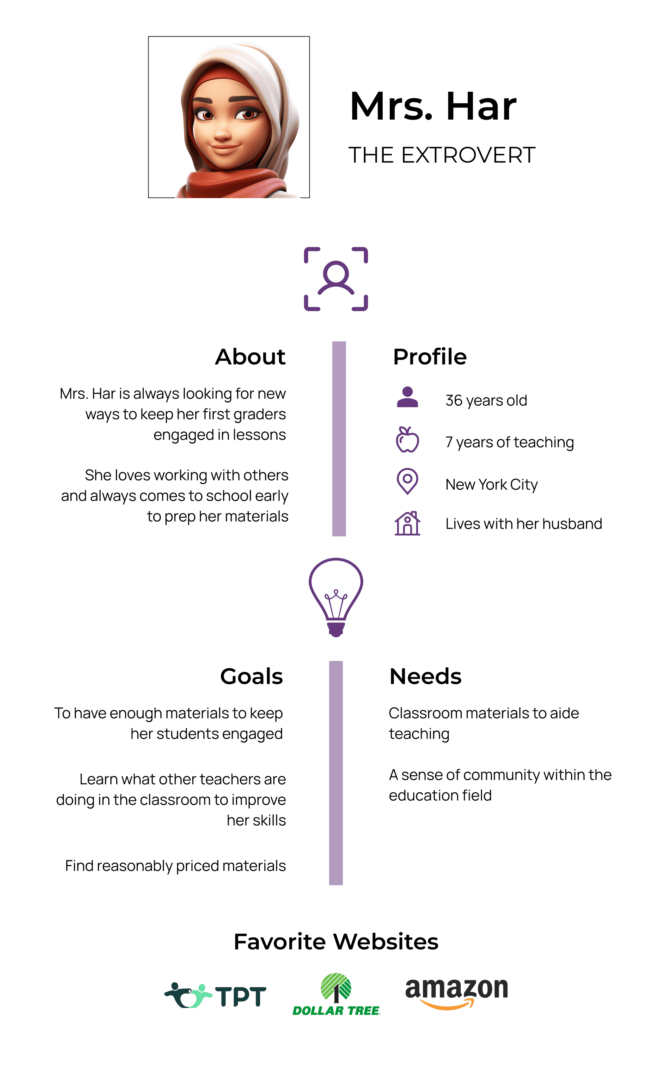
The second user is represented by Joy, another character from Inside Out.


Joy represents a user that is very social and lighthearted.


They’re often resourceful and believe that if they’re not going to be the ones to provide for the students, who will? They love collaborating with others and hope to see more unity among teachers. 

—————————————————————————————————————

————————————————————————

————————————

————————————————————————————————————————————————————————————————

————————————————————————————————————————————————————

Personas

Personas

—————————————————————————————————————

————————————————————————————

————————————————————————————————————————————————————————————————

————————————————————————————————————————————————————

Define

Define

Problem: Educators…

  • Don’t want to spend a lot of money each year on classroom needs


  • Don’t have time to spend countless hours trying to find materials 


  • Feel unsupported by school administrators and other staff

Problem: Educators…

  • Don’t want to spend a lot of money each year on classroom needs


  • Don’t have time to spend countless hours trying to find materials 


  • Feel unsupported by school administrators and other staff

Goals:


  • How might we support teachers in finding the resources they need to reduce the amount of time and money spent on looking for said resources?


  • How might we create a support system for teachers?

Goals:


  • How might we support teachers in finding the resources they need to reduce the amount of time and money spent on looking for said resources?


  • How might we create a support system for teachers?

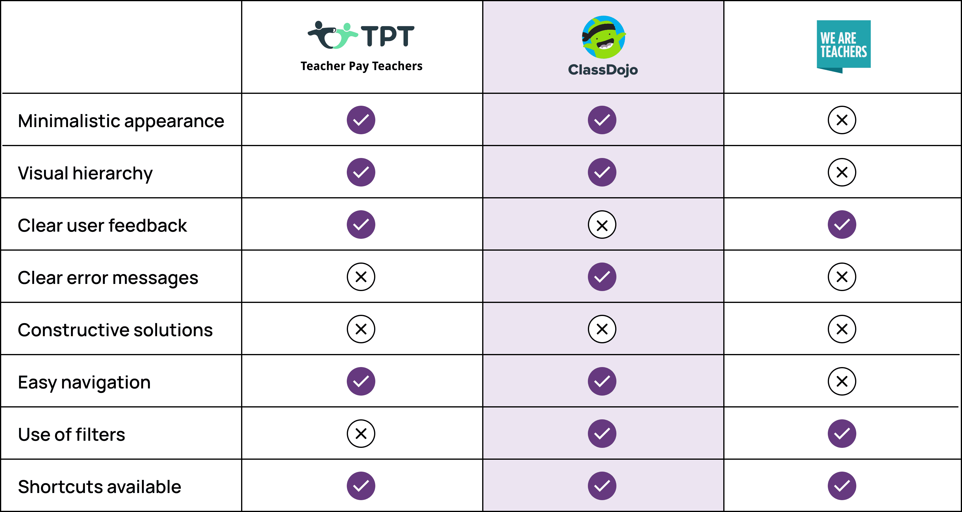
Heuristics Competitor Analysis

Heuristics Competitor Analysis

—————————————————————————————————————

——————————————————————————

—————————————

————————————————————————————————————————————————————————————————

————————————————————————————————————————————————————

Ideate

Ideate

Wireflows

Wireflows

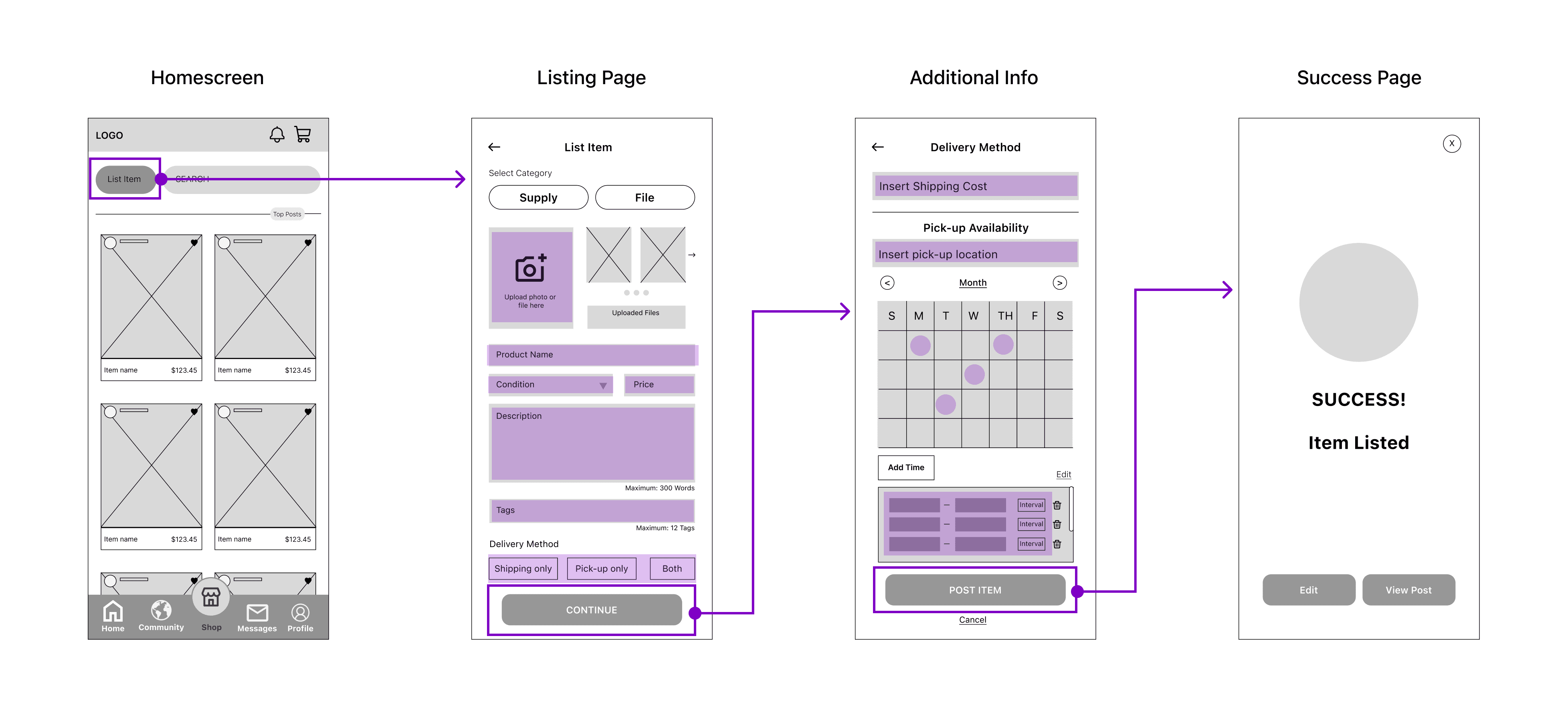
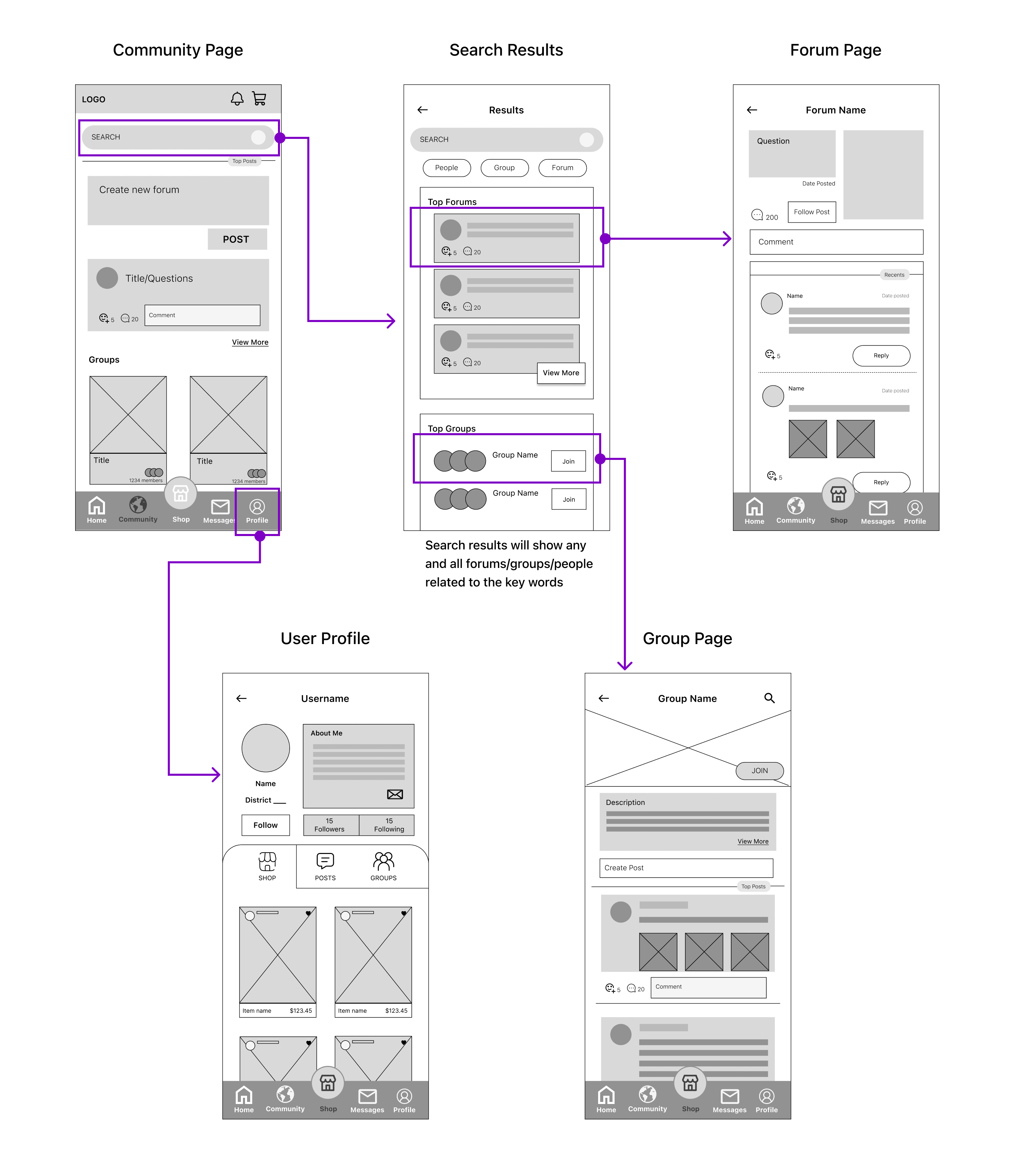
To provide visual context to user flows, low-fidelity wireframes were used
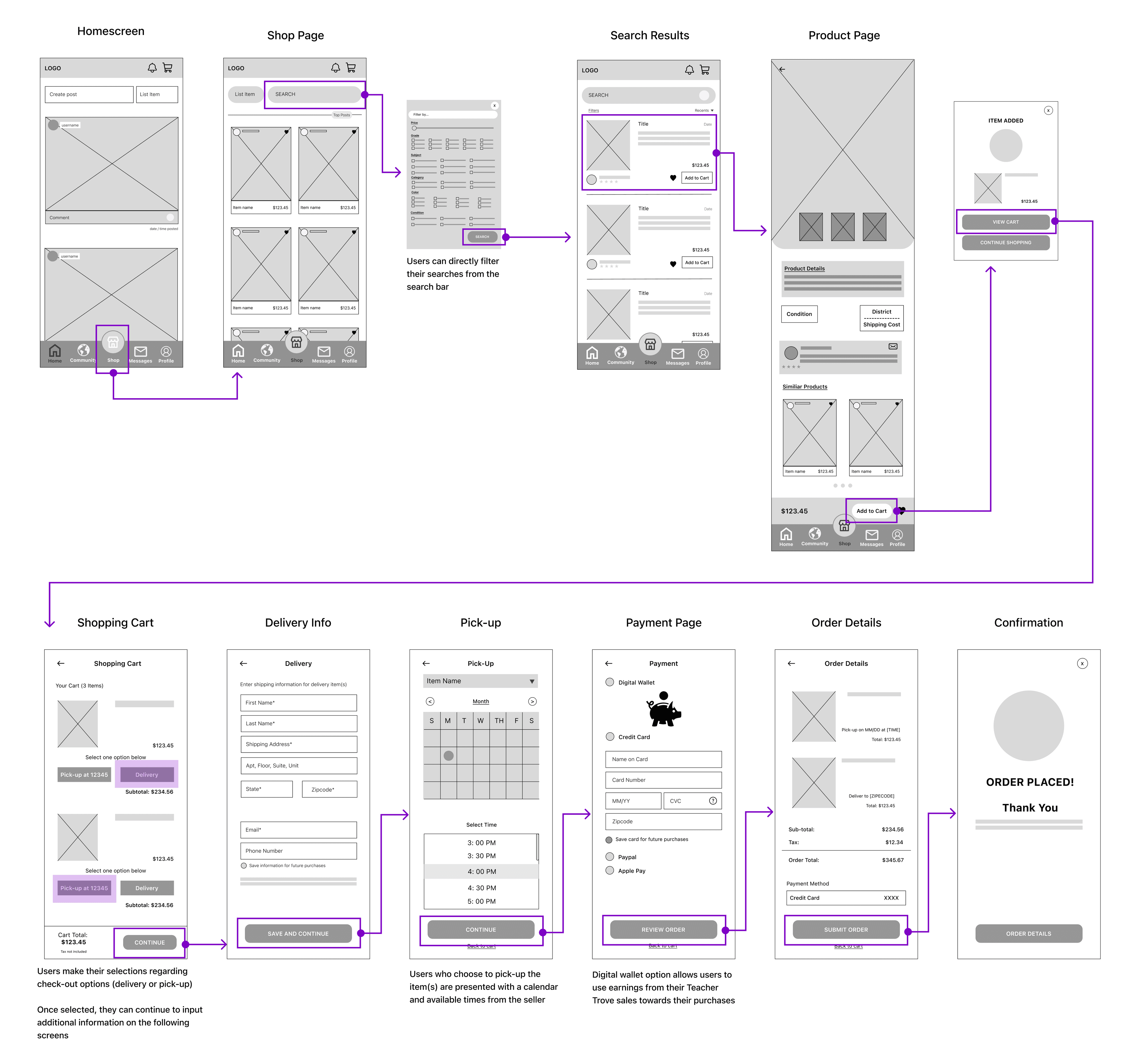
Flow #1: Complete a purchase

Flow #1: Complete a purchase

Flow #2: Sell lightly used classroom goods

Flow #2: Sell lightly used classroom goods

Flow #3: Connect with other educators

Flow #3: Connect with other educators

—————————————————————————————————————

——————————————————————————

—————————————

————————————————————————————————————————————————————————————————

————————————————————————————————————————————————————

Design

Design

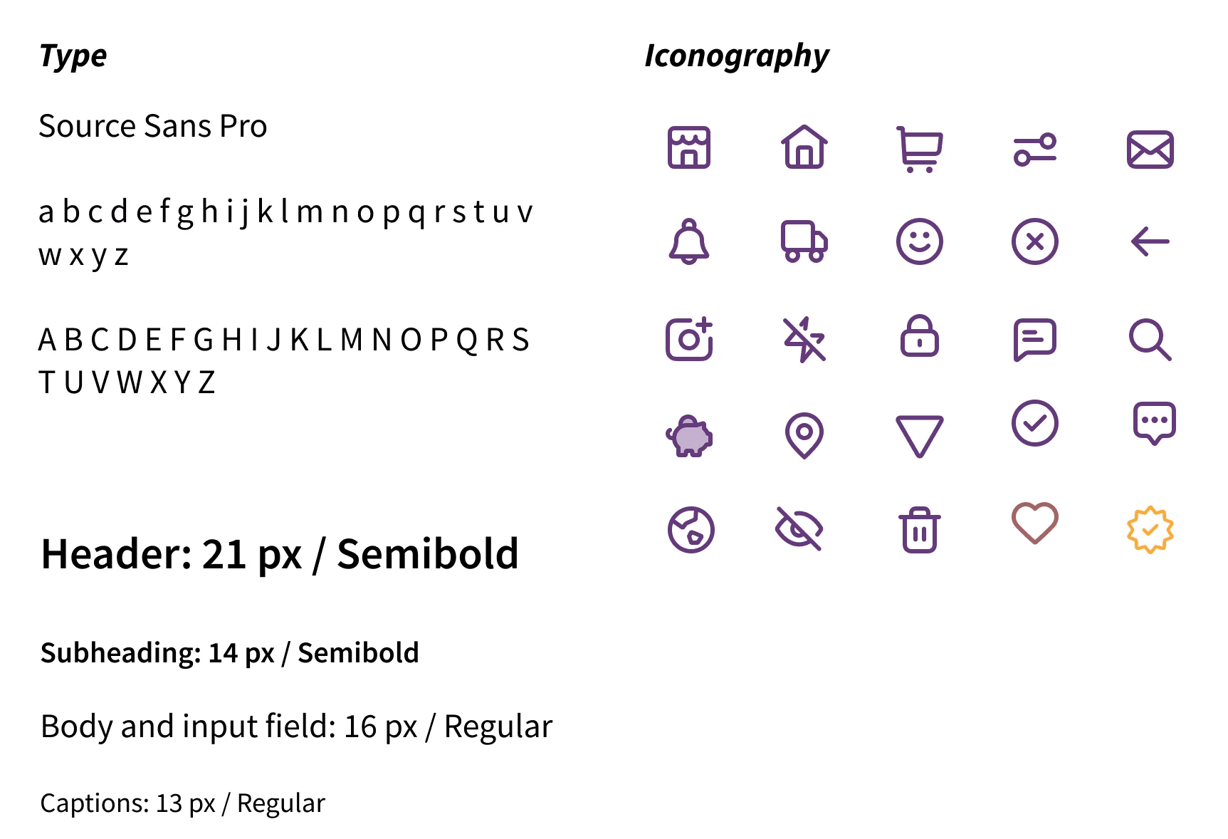
Style Guide

Style Guide

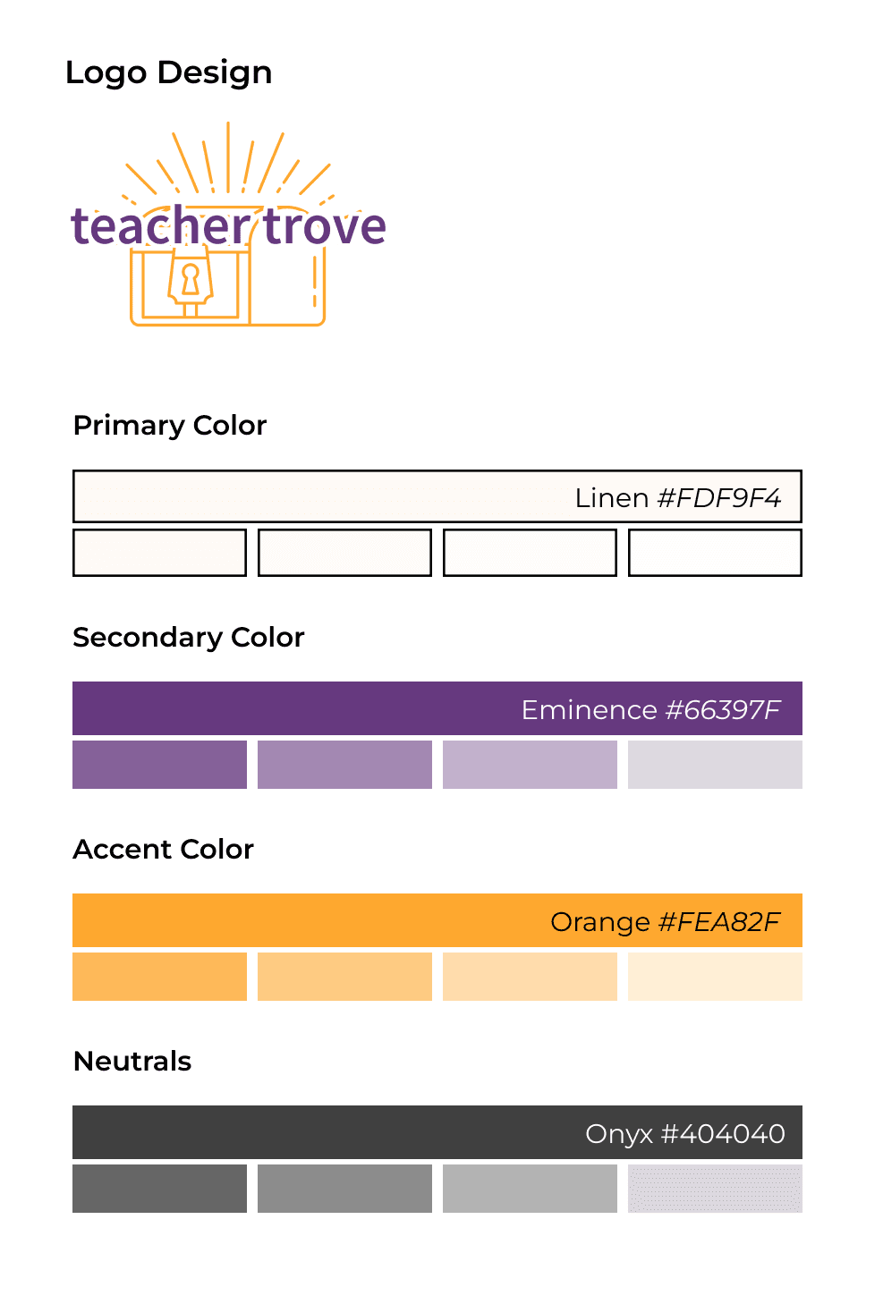
Primary color = Linen

Influenced by the Montessori teaching method, focusing on muted colors that reflect the real world, keeping the environment calm and concentrated to focus on the task at hand.


Secondary color = Eminence

  • Symbolizing wealth through budget-friendly purchases with fellow teachers

  • Creativity through forums and groups that fosters creativity and a strong sense of community.


Accent color = Orange

Despite its work-related nature, the brand aims to ensure that users don't perceive the app as a chore. Instead, it strives to spark joy and excitement

Teachers are often working with outdated technology that includes narrow and decorative styles.


For font inspiration, it was clear that letters should not be too rigid and sharp because the app shouldn’t feel too professional and serious

Source Sans Pro was chosen for the interface to represent a clean and simplistic feel

—————————————————————————————————————

——————————————————————————

—————————————

————————————————————————————————————————————————————————————————

————————————————————————————————————————————————————

Test

Test

Usability Test: Round One

Usability Test: Round One

After conducting a usability test with five participants, four major adjustments were made
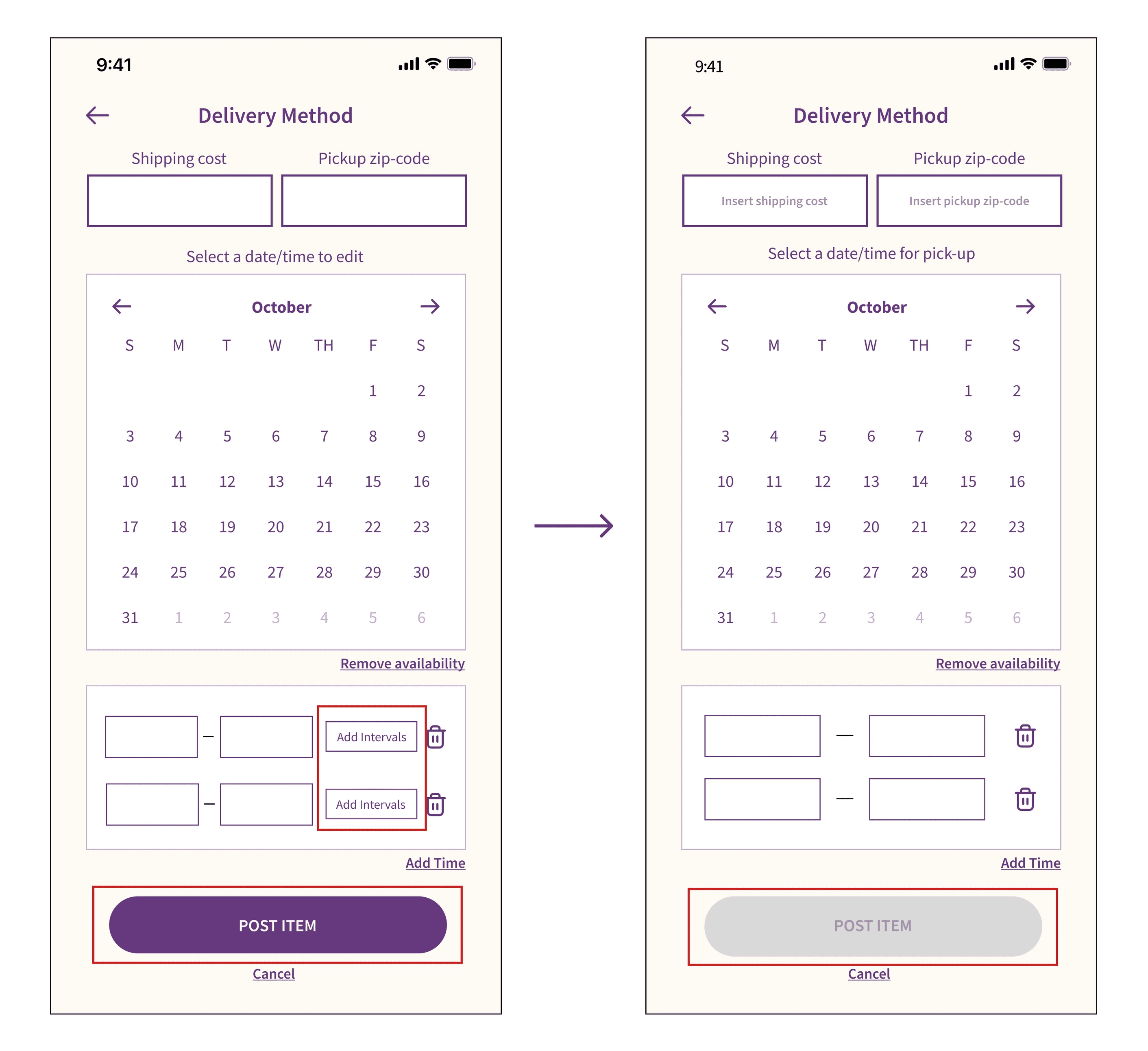
  1. Removing the 'add intervals' button

  1. Removing the 'add intervals' button

Usability test found that 'add intervals' were unnecessary since many users would schedule pick-up times every

30-minutes and would not need to add smaller intervals to the time slots


Users also misunderstood the intention of the button, some assumed they would be able to add the time to different dates


Throughout the test, users attempted to move onto the next stage without completing all required fields, which led me to incorporate the disabled button

Usability test found that 'add intervals' were unnecessary since many users would schedule pick-up times every 30-minutes and would not need to add smaller intervals to the time slots


Users also misunderstood the intention of the button, some assumed they would be able to add the time to different dates


Throughout the test, many users tried to proceed to the next step before completing all fields, leading to enabling disabled buttons.

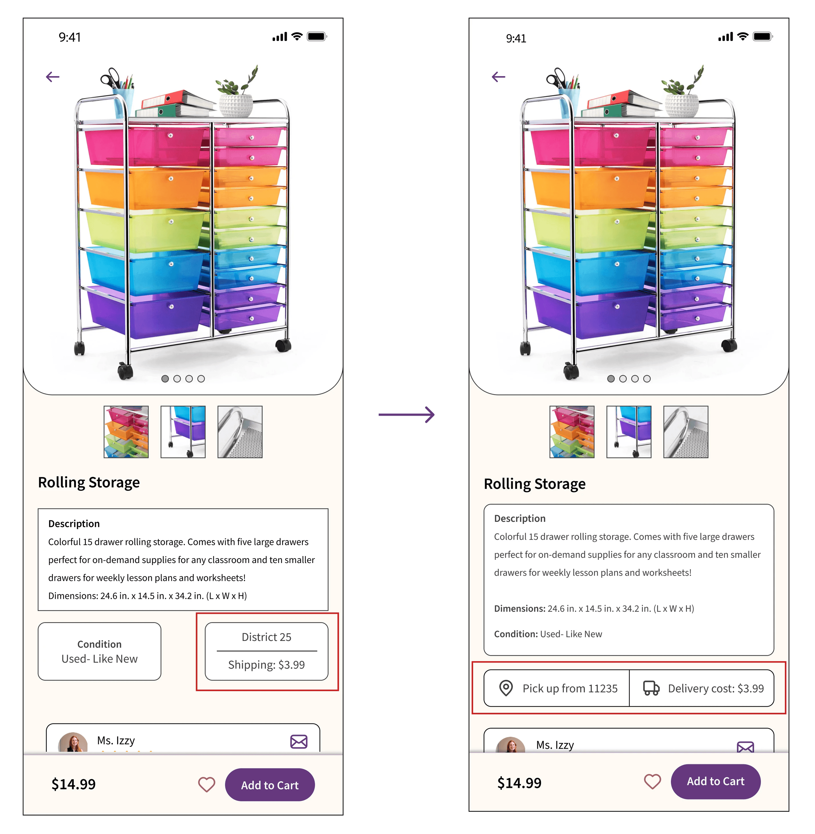
  1. Simplifying pick-up location

  1. Simplifying pick-up location

Pick-up location was not clear for users.


Users often confused ‘District 25’ as the location where the item will be shipped to, not picked up from. 


Icons were included to provide visual cues and minimize text overload


Usability test also revealed some inconsistencies in location entries- some included zipcodes while others were written as districts.
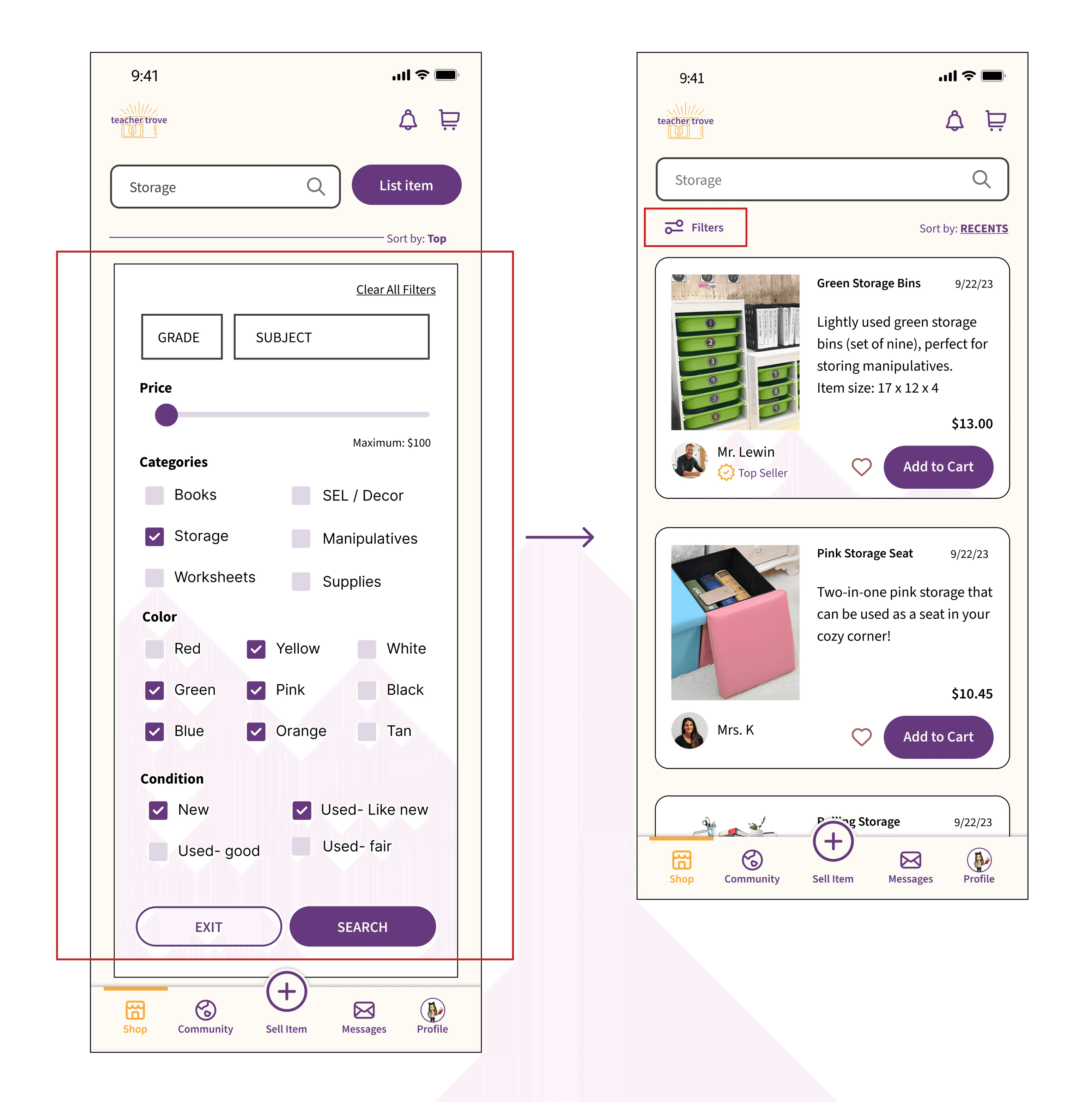
  1. Revising filter option

  1. Revising filter option

Filter pop-up immediately upon searching for an item caused frustrations for users.


Users questioned if they needed to select a filter in order to complete the search


As a result, a search icon was included on the screen only after a user has searched for an item
  1. Improved clarity and coherence

  1. Improved clarity and coherence

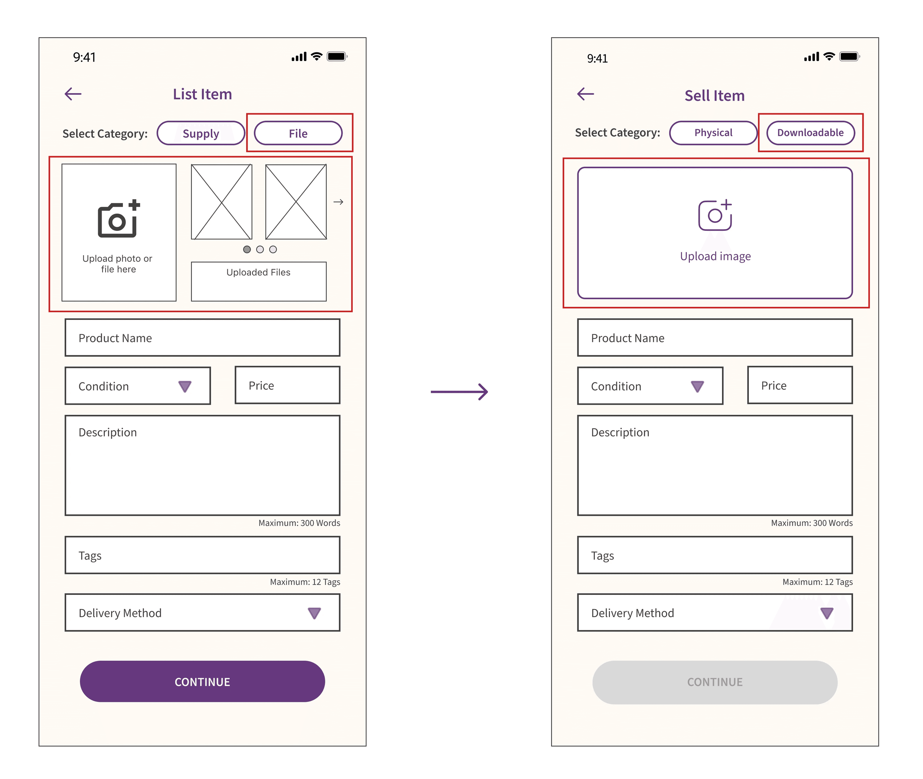
Usability test showed that when users listed an item for sale, the category labeled ‘file’ was not intuitive.


Information was difficult to digest, especially when users tried to upload an image. There were some confusion about what 'Upload files' meant, especially for users who were listing a physical item.


Decluttered the space in order to reduce cognitive load

—————————————————————————————————————

——————————————————————————

————————————

————————————————————————————————————————————————————————————————

————————————————————————————————————————————————————

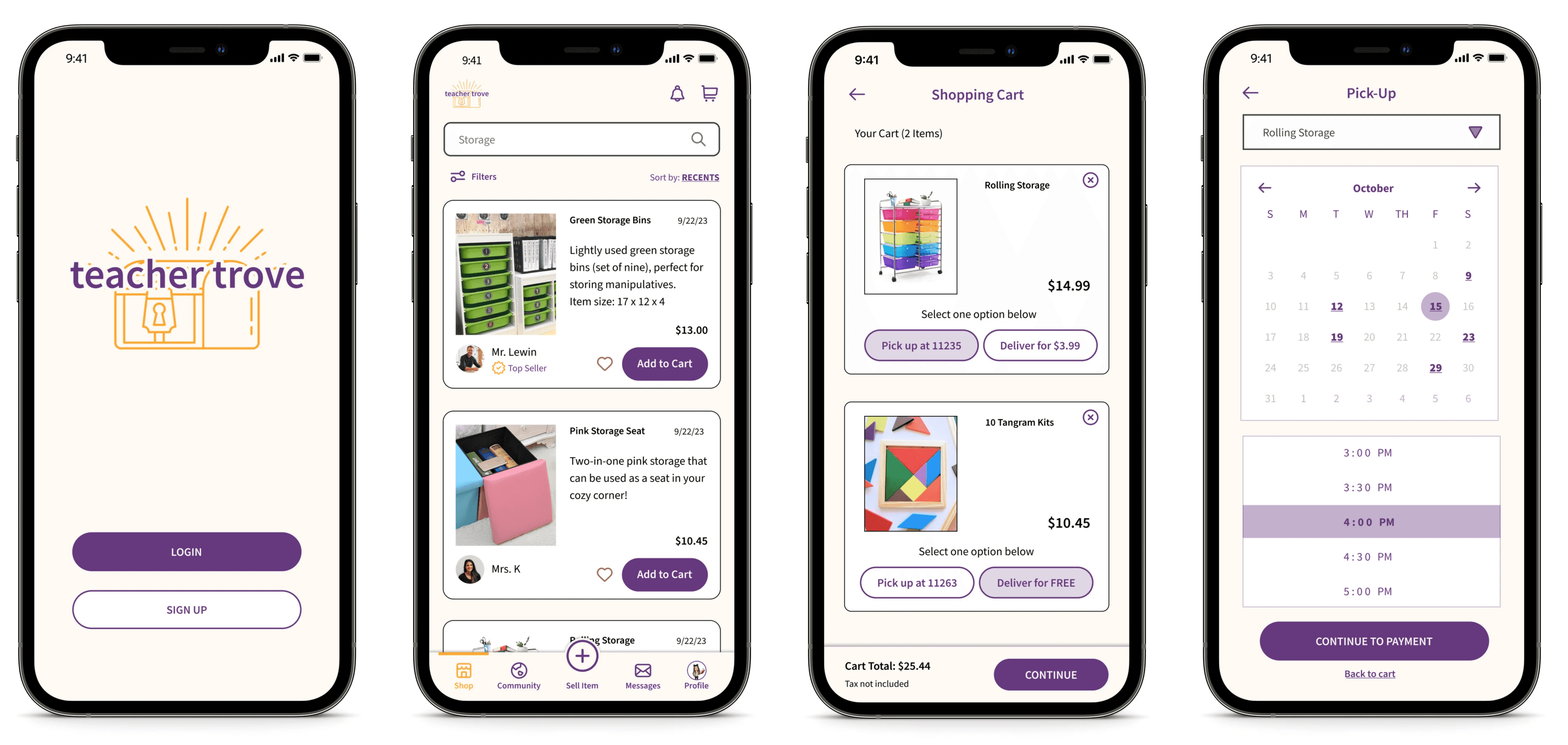
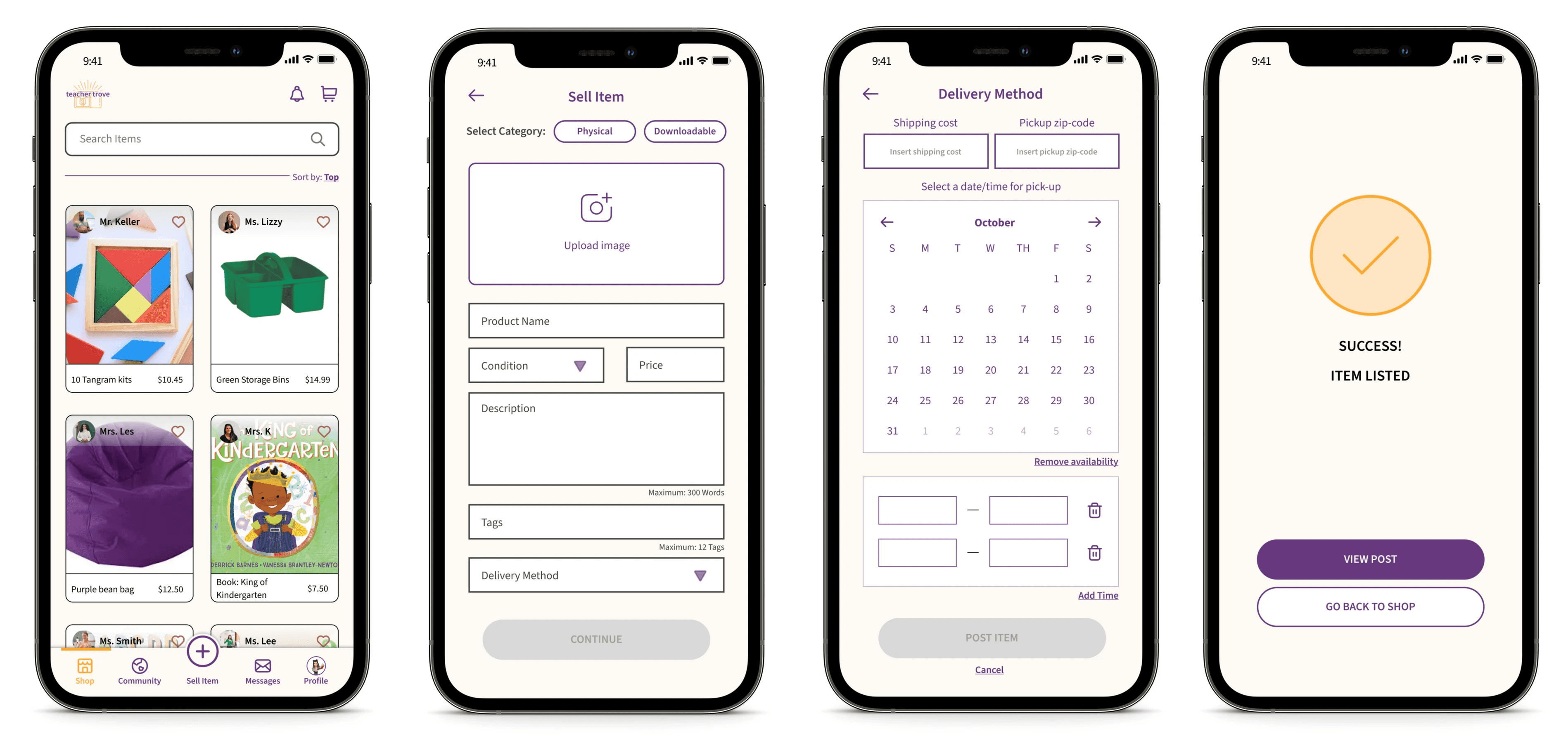
High-Fidelity Mockup

High-Fidelity Mockup

Prototype

Prototype

—————————————————————————————————————

——————————————————————————

————————————

————————————————————————————————————————————————————————————————

————————————————————————————————————————————————————

Usability Test: Round Two

Usability Test: Round Two

With the new iterations, a second round of usability testing was conducted to evaluate the changes. 


It was clear that changes from the first round has shown to be more intuitive 


However, other issues were identified during this round:

Users were confused about the difference between ‘Digital Wallet’ and Apple Pay.

They were also frustrated that they could not change the pickup date/time directly in the check-out screen

—————————————————————————————————————

——————————————————————————

————————————

————————————————————————————————————————————————————————————————

————————————————————————————————————————————————————

Reflection & Next Steps

Reflection & Next Steps

Reflection & Next Steps

Prioritize the user

Prioritize the user

Prioritize the user

Throughout the process, I learned how important it is to keep the user at the focal point every step of the way. When working on brainstorming ideas, a plethora of ideas came to mind, prompting me to explore each one. However, I took a step back and leveraged the data I had collected to ensure the focus remained on addressing user needs, rather than exploring what I thought would be interesting to implement.

Iterate for inclusivity

Iterate for inclusivity

Iterate for inclusivity

Iterations are essential to create a more effortless user experience, and I especially wanted to keep this in mind because teachers of all age ranges and abilities should be able to use this app. By paying attention to details that may often be overlooked, such as communication through visual cues and careful consideration of text and button sizes, I was able to enhance my design and skills to accommodate a diverse range of users.


Next steps include:

1.

1.

1.

Curate user engagement

Curate user engagement

Curate user engagement

Generate content that users are interest in when they first use the app by asking users to select topics of interest during the onboarding phase

2.

2.

2.

Iterate, iterate, iterate

Iterate, iterate, iterate

Iterate, iterate, iterate

Continue iterations by adding an 'edit' button on the Order Confirmation page and differentiate the difference between the digital wallet feature and Apple Pay
Let's connect!

Let's connect!