SAVR is a mobile recipe app with a library of recipes. The company has expressed concerns with the lack of engagement and through some research, users have expressed frustrations using the app due to:
unclear instructions
not knowing if they're on the right track
lack of clear timing and preparation guide
Clear communication of prep, cook, and total time. As well as a checklist feature to help users prepare for the recipe
Increase user confidence and visual guidance by incorporating images, previews, and a progress bar
UXUI Designer

Through user research, it was clear that users did not have a problem selecting a meal, but rather, users are frustrated over the lack of organization and difficult instructions on preparation and next steps of cooking the ingredients.
Taking this into consideration:
How might we create a stress-free experience that sufficiently prepares users and provides accurate and easy-to-follow instructions?
Once the problem was clear, a map of the potential end-to-end user experience was mapped


Recipe apps provide clear user feedback through the use of progress bars and/or numbered steps in order to reduce uncertainty, help set expectations, and provide instant feedback
The apps offer valuable information by providing users with essential details about the recipe: total cooking times, cookware, and images
Some apps allow users the flexibility to control the serving size of the recipe, automatically proportioning the ingredient list to adjust for the change.
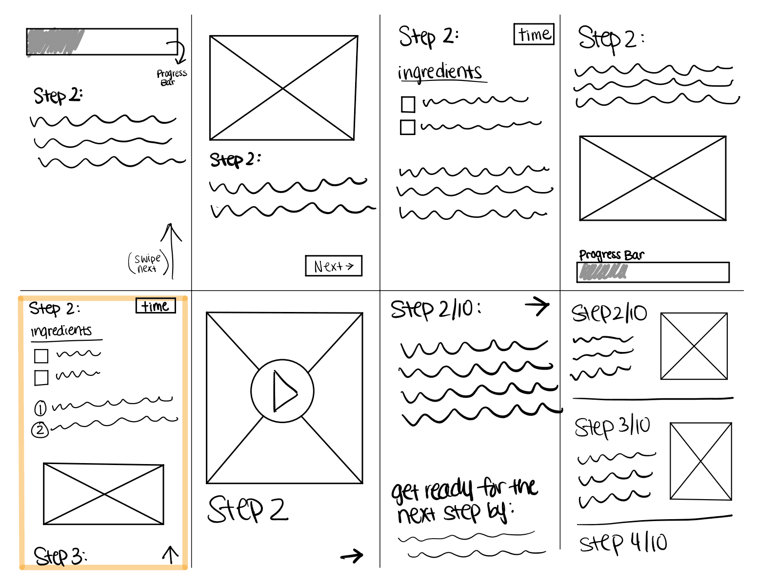
Now it was time to utilize Crazy 8s to brainstorm possible solutions to the problem. The main of focus would be the instructions screen since users have voiced their frustrations over unclear instructions, lack of organization, and uncertainties when cooking.
After careful analysis, the fifth solution was selected as the screen to further ideate
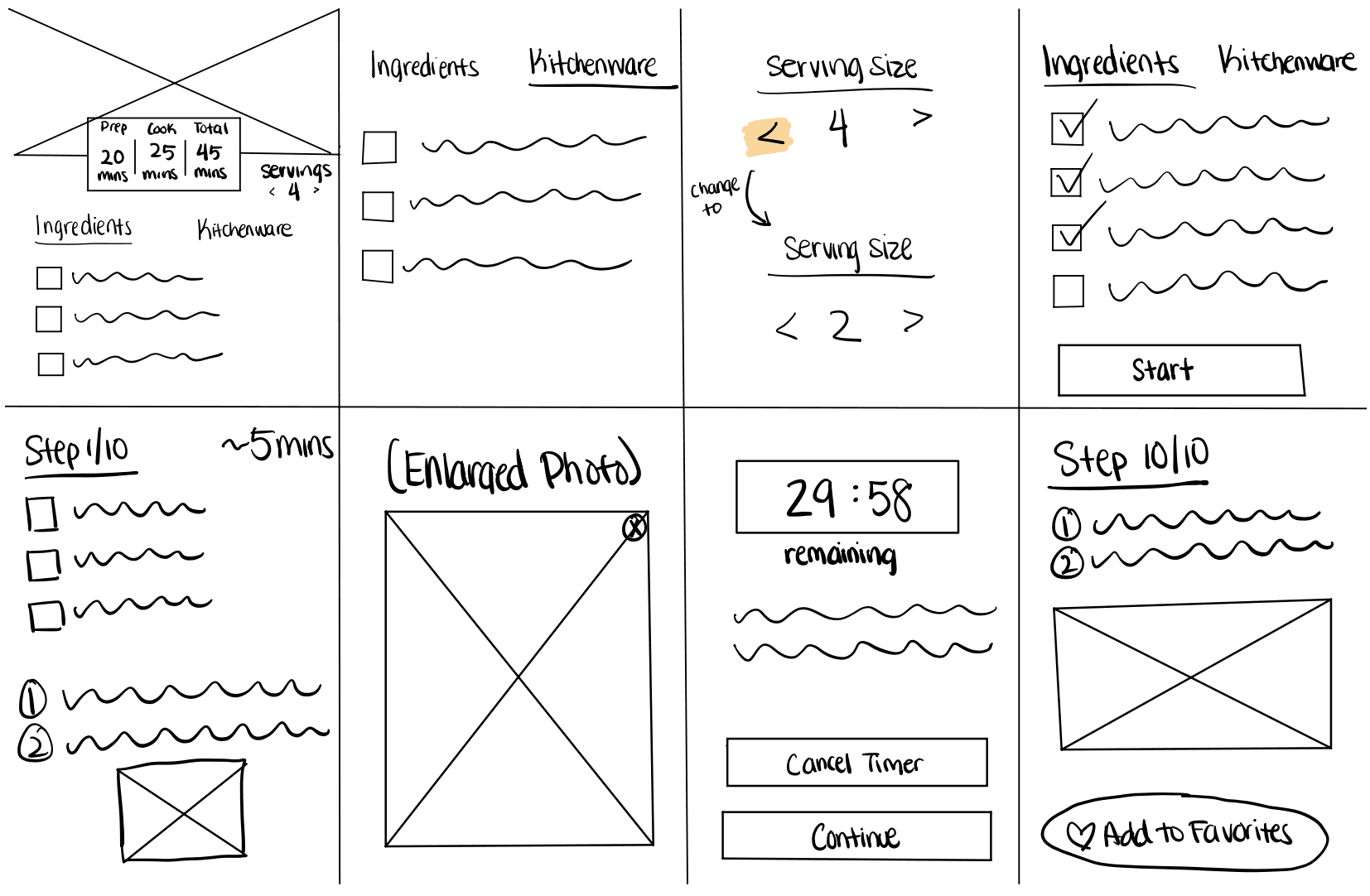
Storyboard
Timing
Clear prep time, cook time, and total time at the beginning of the user experience allow users to gauge exactly what they’re signing up for.
Checklist
Providing a checklist of the ingredients allows users to be organized and better prepared to start the cooking process
Images
Providing an image for each step would provide visual guidance and a sense of reassurance to users.
Progress Bar
Along with images, a progress bar would help users stay on track. It serves to keep users informed about how far along they are in their recipe, and sets expectations
Preview
A preview of the next step in the recipe would minimize user uncertainty
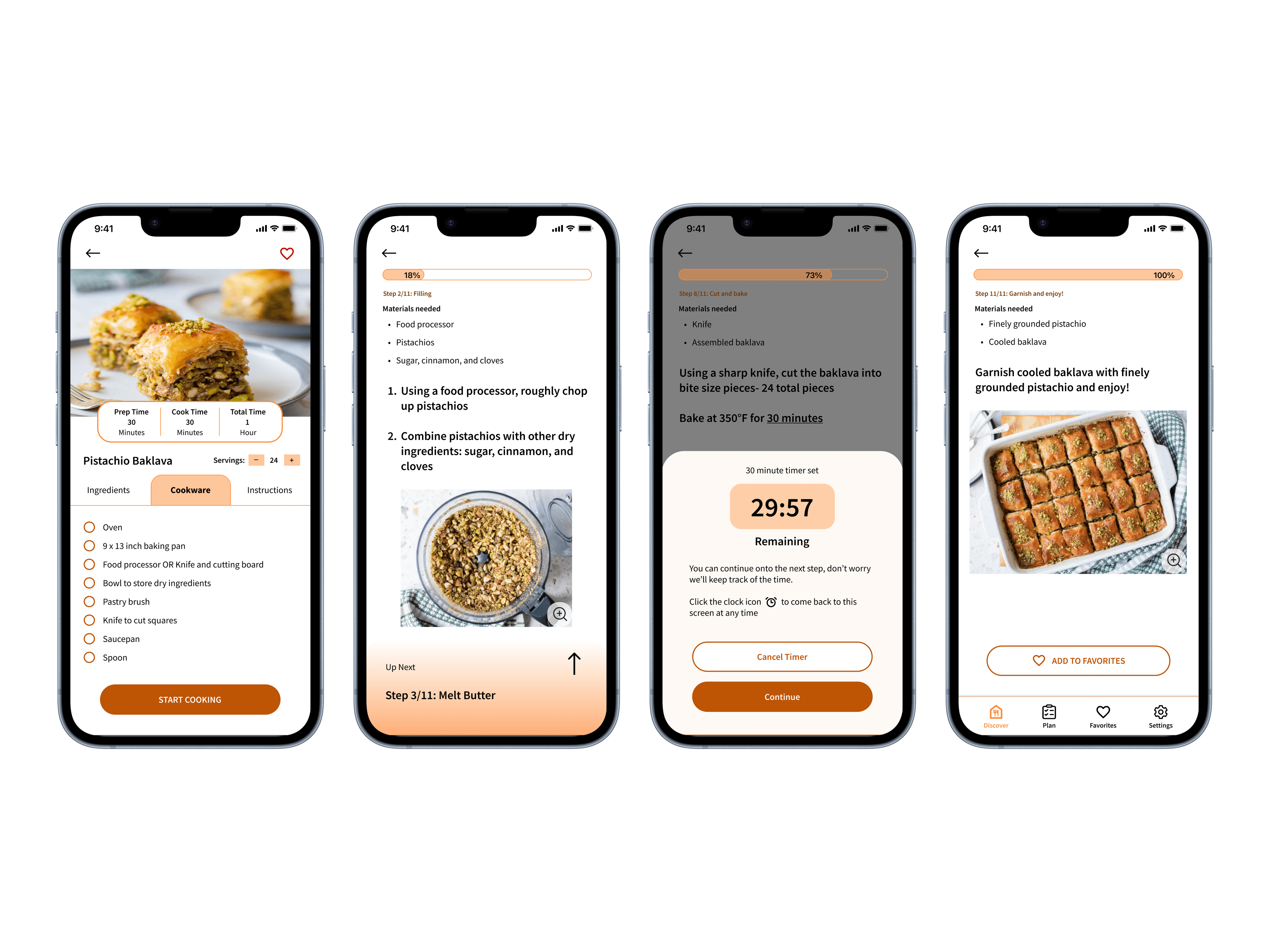
Next, a prototype was created to test the solution with users on day five. Throughout the process, the company color Orange was used as the primary color. Key UI features to improve user experience include:
on instructions help to improve user experience by ensuring the text is readable even if users are not close to their device
to provide visual clarity, assurance, and accessibility for users who may need additional guidance
to guide users attention to the next steps of the recipe and how to interact with the screen to proceed
After conducting a usability test with five participants, two major adjustments were made
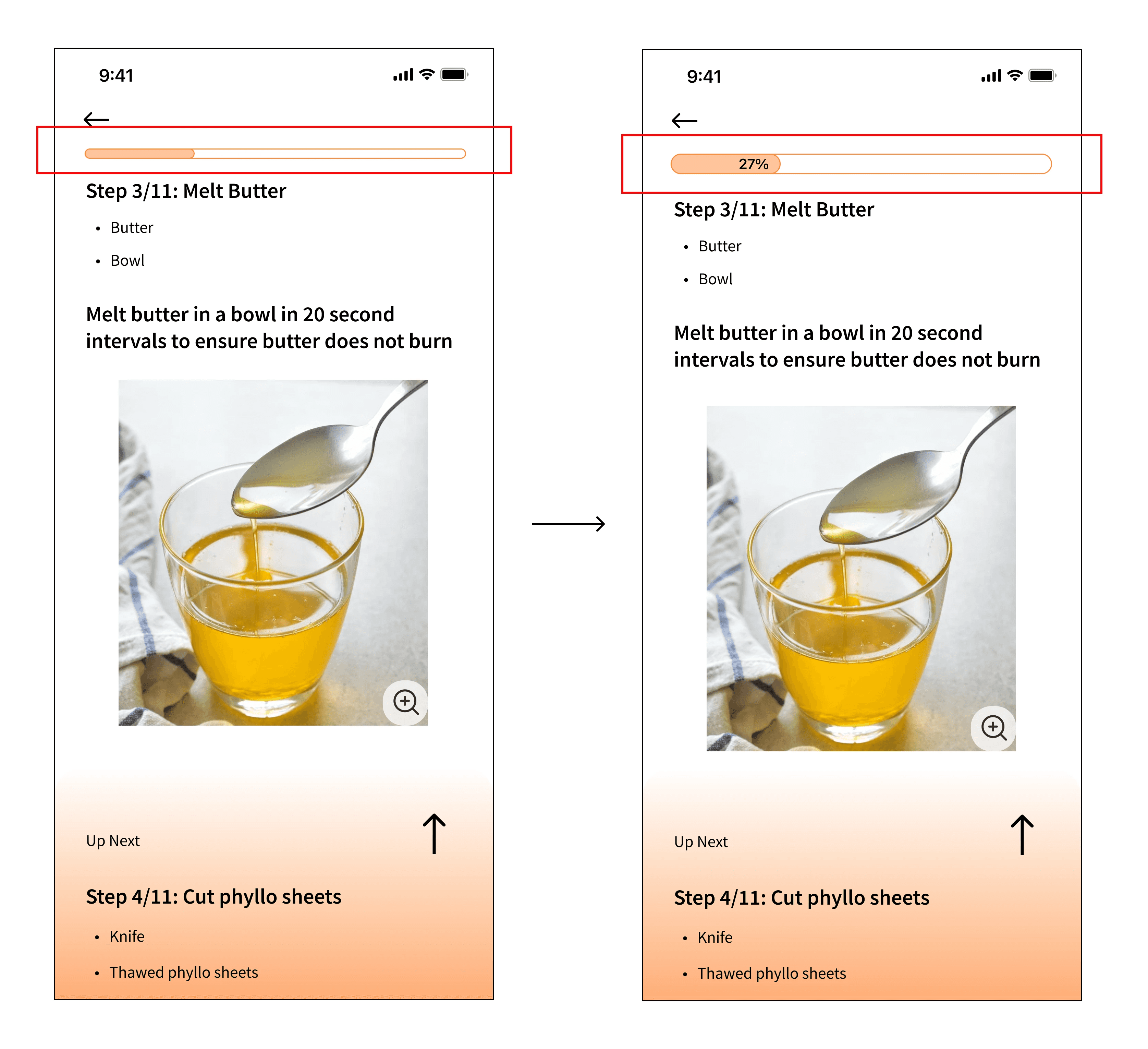
Users failed to identify the progress bar was a progress bar until halfway through the recipe.
To bring more emphasis on the progress bar and to better communicate to users what they're seeing, numerical values representing the percentages were added
Without a clear heading, the bulleted ingredients within the steps caused some confusion. Some users took a few seconds to realize that the bullets, were in fact, the ingredient list for the specific step
To provide better context, a subheading was introduced and visual hierarchy was enhanced (see reflection below)
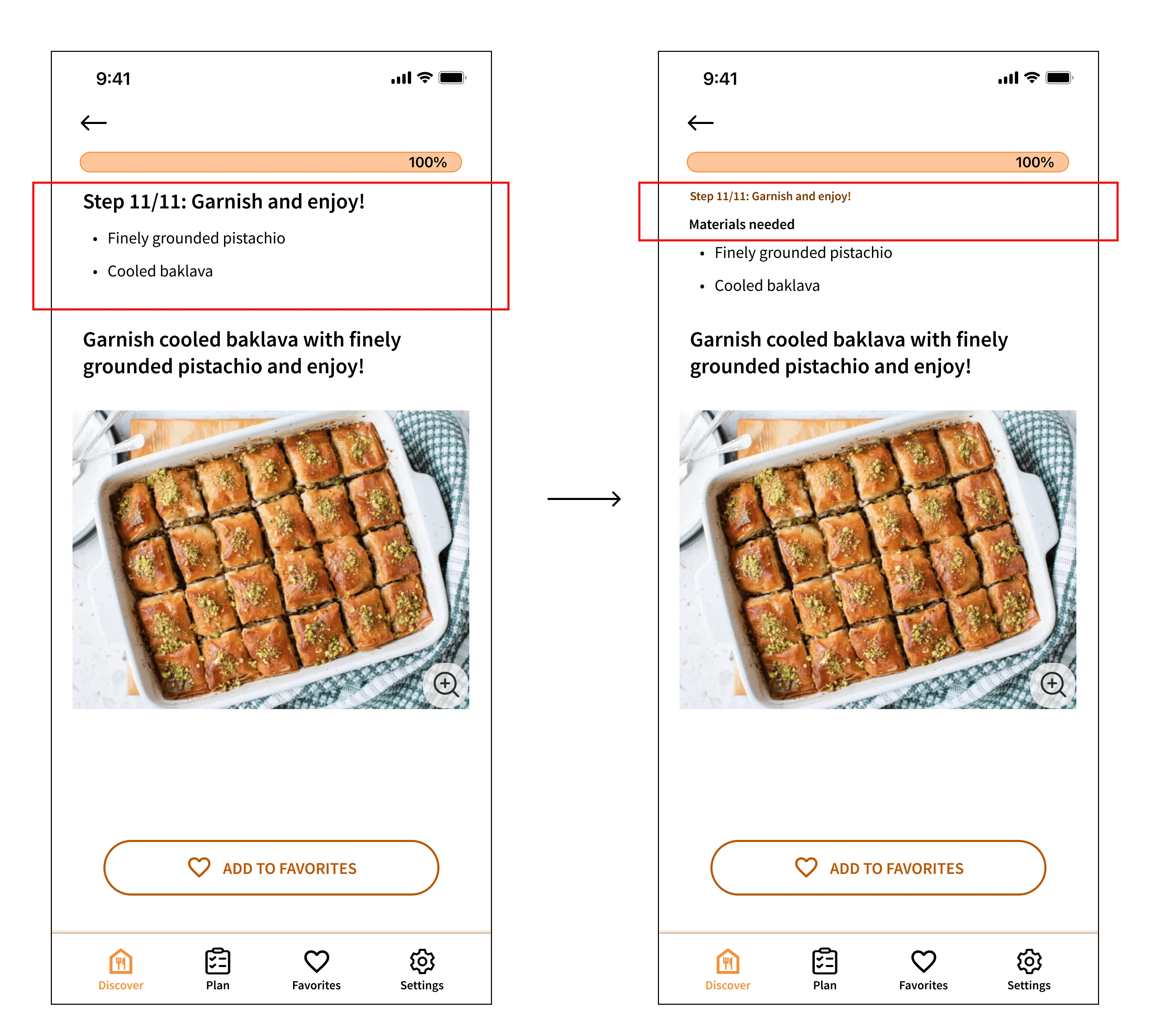
When taking another look at the UI, I discovered an opportunity to enhance visual hierarchy. Oftentimes, the body text is smaller than the heading, however, my idea for a large body text centered around practicality, especially for users who may want to take a quick glance at their phones on the counter. I later realized that it would clash with the header text, leading me to reflect on which one to prioritize- the header or the body. I found that the header may not need the same level of prominence and could be minimized for better balance
While prototyping, I realized I was addressing multiple user pain points instead of focusing on the primary ones. Inspired by a user's frustration with constant handwashing and phone checking, I explored voice command solutions. However, I later recognized I was investing time in a solution that was not aligned with the user's main frustration. In a design sprint, it is crucial to prioritize and test solutions efficiently, avoiding exhaustive problem-solving and detailed wireframes.
Next steps include:
Clarify techniques, increase confidence, and create a multisensory experience for users by embedding videos or GIFs for more complex cooking techniques
Iterate based on feedback, including:
Increasing the visibility of the 'Start Cooking' text on the instructions page
Modifying the user flow to allow users to return to a specific step without the need to click the back arrow multiple times
